

Artificial intelligence and machine learning are no longer the exclusive domain of data scientists and software engineers. Today, Microsoft Excel – the tool sitting on over 750 million computers worldwide – has quietly become one of the most accessible entry points into the world of machine learning and predictive analytics.
Whether you want to forecast next quarter’s sales, cluster your customers into groups, detect outliers in your data, or build a simple prediction model, Excel has tools that can help you do all of it – without a single line of code in most cases, and with a little Python when you need more power.
This complete guide covers everything: what machine learning actually means in the context of Excel, which built-in tools and functions are available right now, how to apply them to real data, and how to go further with Python integration. By the end, you will have a clear, practical understanding of exactly how to use machine learning in Excel at every skill level.
What Does Machine Learning in Excel Actually Mean?
Before diving into tools and formulas, it is important to set realistic expectations. Excel is not a dedicated machine learning platform like TensorFlow, scikit-learn, or Azure ML. But that does not mean Excel is powerless – far from it.
Machine learning in Excel falls into three distinct categories, depending on your skill level and what you want to achieve:
| Category | What It Uses | Skill Level Required | Best For |
| Built-in Statistical Functions | FORECAST, TREND, LINEST, CORREL, GROWTH | Beginner | Simple prediction, trend analysis, correlation |
| AI-Powered Excel Features | Analyze Data, Ideas, Linked Data Types | Beginner to Intermediate | Pattern discovery, auto insights, data enrichment |
| Python Integration in Excel | Python + scikit-learn, pandas, matplotlib | Intermediate to Advanced | Real ML models: regression, clustering, classification |
| Power Query + Power BI | M language, DAX, Power BI visuals | Intermediate | Large data, dashboards, automated ML |
This guide covers all four categories in depth. Start with Section 2 if you are a beginner and work your way through – or jump directly to the section that matches your current skill level.
Machine learning in Excel is not about replacing data scientists. It is about giving business users, analysts, HR managers, and finance teams access to predictive and pattern-finding tools they already trust – inside a tool they already use every day.
Built-In Excel Functions for Prediction and Analysis
Excel has had statistical and forecasting functions for decades. These are the original machine learning tools for Excel users – they apply real mathematical models to your data without requiring any programming knowledge.
FORECAST.ETS: Time Series Forecasting with Seasonality
FORECAST.ETS is Excel’s most powerful built-in forecasting function. It uses Exponential Triple Smoothing (ETS) – a genuine machine learning algorithm – to predict future values in a time series, automatically detecting seasonality patterns in your data.
=FORECAST.ETS(target_date, values, timeline, [seasonality], [data_completion], [aggregation])

' Practical example - predict next month's sales:
=FORECAST.ETS(DATE(2024,7,1), B2:B24, A2:A24, 12, 1)

' A2:A24 = dates (timeline)
' B2:B24 = actual sales values
' 12     = seasonality (12 months = annual pattern)
' 1      = fill missing data automatically
When to Use FORECAST.ETS: Use FORECAST.ETS when your data has a time component (monthly sales, weekly traffic, daily temperatures) and you suspect seasonal patterns. It outperforms simple linear forecasting in almost every real-world business dataset.
FORECAST.LINEAR: Simple Linear Prediction
FORECAST.LINEAR predicts a value based on a straight-line relationship between two variables. It is the Excel implementation of simple linear regression – one of the most foundational machine learning algorithms.
=FORECAST.LINEAR(x, known_y's, known_x's)

' Predict sales when advertising spend = 50,000:
=FORECAST.LINEAR(50000, B2:B20, A2:A20)

' A2:A20 = advertising spend (independent variable X)
' B2:B20 = actual sales (dependent variable Y)
TREND: Multi-Variable Linear Regression
TREND is more powerful than FORECAST.LINEAR because it supports multiple predictor variables simultaneously. This is multiple linear regression – the same algorithm used in many ML models.
' Array formula - press Ctrl+Shift+Enter
=TREND(known_y's, known_x's, new_x's, const)

' Predict revenue based on 3 factors: leads, spend, team size
=TREND(D2:D20, A2:C20, A21:C21, TRUE)

' D2:D20   = Revenue (what we want to predict)
' A2:C20   = Leads, Ad Spend, Team Size (predictors)
' A21:C21  = New values for prediction
CORREL: Correlation Analysis
Before building any prediction model, you need to know which variables are actually related to your outcome. CORREL measures the strength and direction of the relationship between two variables, returning a value between -1 and +1.
=CORREL(array1, array2)

' How strongly does temperature correlate with ice cream sales?
=CORREL(A2:A100, B2:B100)

' Result interpretation:
' 0.8 to 1.0  = Strong positive correlation
' 0.4 to 0.8  = Moderate positive correlation
' 0.0 to 0.4  = Weak or no correlation
' Negative values = Inverse relationship
LINEST: Full Linear Regression Statistics
LINEST is the most statistically complete regression function in Excel. It returns not just the prediction coefficients, but also R-squared, standard error, F-statistic, and more – giving you the full picture of your model’s quality.
' Array formula - press Ctrl+Shift+Enter across 5 rows x 3 cols
=LINEST(known_y's, known_x's, TRUE, TRUE)

' Returns a 5-row statistics table:
' Row 1: Coefficients (slope, intercept)
' Row 2: Standard errors
' Row 3: R-squared, Standard error of estimate
' Row 4: F-statistic, Degrees of freedom
' Row 5: Regression SS, Residual SS| Function | Algorithm | Use Case | Returns |
| FORECAST.ETS | Exponential Triple Smoothing | Time series with seasonality | Single predicted value |
| FORECAST.LINEAR | Simple Linear Regression | One predictor → one outcome | Single predicted value |
| TREND | Multiple Linear Regression | Multiple predictors → outcome | Array of predictions |
| GROWTH | Exponential Regression | Compound growth prediction | Array of predictions |
| CORREL | Pearson Correlation | Variable relationship strength | -1 to +1 coefficient |
| LINEST | Full OLS Regression | Complete regression analysis | 5-row statistics table |
Excel’s AI-Powered Features – Machine Learning You Already Have
Beyond formulas, Microsoft has embedded genuine AI and machine learning capabilities directly into Excel’s interface. These features require no formula knowledge – they work with just a few clicks.
Analyze Data (formerly Ideas)
Analyze Data is Excel’s built-in AI assistant for data exploration. It automatically scans your dataset and surfaces meaningful patterns, trends, outliers, and distributions – the same tasks a data analyst would spend hours on manually.
How to use it: Click anywhere in your data table, then go to Home tab and click Analyze Data (or Ideas in older versions). A panel opens on the right with AI-generated insights, charts, and pattern summaries specific to your data.
| What Analyze Data Detects | Example Output |
| Top contributors to a total | ‘Region North accounts for 43% of total revenue’ |
| Unusual spikes or drops | ‘August sales dropped 28% below the seasonal average’ |
| Distribution patterns | ‘67% of orders fall in the $50-$200 price range’ |
| Correlation highlights | ‘Customer age and purchase value show a moderate positive trend’ |
| Ranking and comparison | ‘Product A outperforms all others in Q3 and Q4’ |
Insider Tip: Analyze Data Works Best on Formatted Tables Convert your data to an Excel Table (Ctrl+T) before using Analyze Data. The AI generates significantly more relevant and accurate insights when working with structured table objects compared to plain cell ranges.
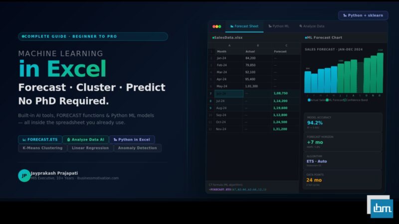
Forecast Sheet: One-Click ML Forecasting
Forecast Sheet is Excel’s most underused ML feature. With a single click, it builds a complete time series forecast – including confidence intervals – and presents it as a fully formatted chart and data table.
- Select your time series data (date column + value column).
- Go to Data tab and click Forecast Sheet.
- Set your forecast end date in the dialog.
- Click Create. Excel builds the forecast chart and table automatically.
Behind the scenes, Forecast Sheet uses the same FORECAST.ETS algorithm – but wraps it in a visual interface that non-technical users can operate in under 30 seconds. The output includes a lower and upper confidence bound, giving stakeholders an honest view of forecast uncertainty.
Linked Data Types: Real-Time External Data
Excel’s Linked Data Types connect your spreadsheet cells to live external data sources – stock prices, company information, geographic data, and more. This is Microsoft’s data enrichment layer, and it is powered by AI classification on the backend.
To use it: type a company name or stock ticker in a cell, select it, and click the Stocks or Geography data type from the Data tab. Excel recognizes the entity and links it to a live data card with dozens of attributes you can pull into your sheet with a formula.
Real-World Use Case: Competitive Analysis Type 10 competitor company names in column A. Apply the Stocks data type. Then use formulas like =A2.[Market Cap] and =A2.[P/E Ratio] to auto-populate a complete competitive analysis table that updates in real time – no web scraping, no manual data entry.
Python in Excel – Real Machine Learning Models
Microsoft introduced Python integration directly inside Excel in 2023. This is a game-changer for anyone who wants to run genuine machine learning models – classification, clustering, neural networks – on Excel data without leaving the spreadsheet.
Version Requirement
Python in Excel is available in Microsoft 365 (subscription) only, currently rolling out to Excel for Windows. It requires no Python installation – the Python environment runs in Microsoft’s cloud.
How Python in Excel Works
Python code runs inside a special cell type called a PY cell. You enter your Python code in the formula bar using the =PY() function, and Excel passes your data to Python, runs the code, and returns the result back into the cell – as a value, a table, or even an interactive chart.
# Example: Load Excel range into a pandas DataFrame
import pandas as pd

# xl() function reads Excel ranges into Python
df = xl('SalesData[#All]', headers=True)

# Basic data summary
df.describe()
Linear Regression with scikit-learn in Excel
With Python in Excel, you can run a complete scikit-learn regression model on your spreadsheet data and return the predictions directly into Excel cells – ready to use in dashboards, reports, and further calculations.
import pandas as pd
from sklearn.linear_model import LinearRegression
from sklearn.model_selection import train_test_split
from sklearn.metrics import r2_score

# Load data from Excel table
df = xl('SalesData[#All]', headers=True)

# Define features and target
X = df[['Ad_Spend', 'Team_Size', 'Leads']]
y = df['Revenue']

# Split into training and testing sets
X_train, X_test, y_train, y_test = train_test_split(
    X, y, test_size=0.2, random_state=42)

# Train the model
model = LinearRegression()
model.fit(X_train, y_train)

# Make predictions
predictions = model.predict(X_test)

# Model accuracy
r2 = r2_score(y_test, predictions)
print(f'R-squared: {r2:.4f}')

# Return predictions to Excel
pd.DataFrame({'Predicted Revenue': predictions})
Customer Clustering with K-Means in Excel
K-Means clustering is an unsupervised machine learning algorithm that groups data points into clusters based on similarity. In a business context, this is customer segmentation – automatically discovering which customers behave alike.
import pandas as pd
from sklearn.cluster import KMeans
from sklearn.preprocessing import StandardScaler

# Load customer data from Excel
df = xl('CustomerData[#All]', headers=True)

# Select features for clustering
features = df[['Purchase_Frequency', 'Avg_Order_Value', 'Days_Since_Last_Purchase']]

# Scale features (important for K-Means)
scaler = StandardScaler()
X_scaled = scaler.fit_transform(features)

# Run K-Means with 4 clusters
kmeans = KMeans(n_clusters=4, random_state=42, n_init=10)
df['Customer_Segment'] = kmeans.fit_predict(X_scaled)

# Label clusters meaningfully
segment_labels = {0:'Champions', 1:'At-Risk', 2:'New Customers', 3:'Dormant'}
df['Segment_Name'] = df['Customer_Segment'].map(segment_labels)

# Return segmented data to Excel
df[['Customer_ID', 'Segment_Name']]
What This Gives You
Each customer in your Excel table gets automatically labeled with a segment: Champions, At-Risk, New Customers, or Dormant. Your marketing team can immediately filter by segment and personalize campaigns – directly inside Excel, no separate BI tool needed.
Anomaly Detection with Isolation Forest
Isolation Forest is a machine learning algorithm that identifies anomalies in data – rows that are unusually different from the rest. In Excel, this translates to detecting fraudulent transactions, data entry errors, or unusual business events.
import pandas as pd
from sklearn.ensemble import IsolationForest

# Load transaction data
df = xl('Transactions[#All]', headers=True)

# Select numeric columns for anomaly detection
X = df[['Amount', 'Frequency', 'Hour_of_Day']]

# Train Isolation Forest
clf = IsolationForest(contamination=0.05, random_state=42)
df['Anomaly'] = clf.fit_predict(X)

# -1 = anomaly, 1 = normal
df['Flag'] = df['Anomaly'].map({-1: 'REVIEW REQUIRED', 1: 'Normal'})

# Return flagged transactions
df[['Transaction_ID', 'Amount', 'Flag']]
Real-World ML Use Cases in Excel – Industry by Industry
Machine learning in Excel becomes most valuable when applied to specific, recognizable business problems. Here are the most impactful use cases organized by industry.
| Industry | ML Problem | Excel Approach | Business Value |
| Sales | Revenue forecasting | FORECAST.ETS + Forecast Sheet | Inventory planning, target setting |
| HR | Employee churn prediction | Python: Logistic Regression | Proactive retention programs |
| Finance | Expense anomaly detection | Python: Isolation Forest | Fraud prevention, audit flagging |
| Marketing | Customer segmentation | Python: K-Means Clustering | Personalized campaign targeting |
| Operations | Demand forecasting | FORECAST.ETS + seasonality | Supply chain optimization |
| Retail | Price elasticity modeling | LINEST + TREND functions | Dynamic pricing strategy |
| Healthcare | Patient readmission risk | Python: Random Forest | Resource allocation planning |
| Real Estate | Property price prediction | TREND + multiple regression | Valuation and investment decisions |
Step-by-Step – Build a Sales Forecast Model in Excel
Let us walk through a complete, end-to-end example: building a 6-month sales forecast for a retail business using only built-in Excel features. No Python required.
Step 1: Prepare Your Data
- Open Excel and create two columns: Date (column A) and Sales (column B).
- Enter at least 12 months of historical monthly sales data.
- Select both columns and press Ctrl+T to convert to a Table. Name it SalesHistory.
Step 2: Check for Seasonal Patterns Using a Chart
- Select your data table.
- Insert a Line Chart. Look for patterns that repeat at the same time each year – that indicates seasonality.
- If you see consistent peaks and troughs, use FORECAST.ETS. If the trend is smooth, FORECAST.LINEAR is sufficient.
Step 3: Generate the Forecast with Forecast Sheet
- Click anywhere inside your data.
- Go to Data tab, click Forecast Sheet.
- Set Forecast End to 6 months from your last data point.
- Expand Options – verify Seasonality is set to Detect Automatically.
- Click Create. Excel generates the forecast table and chart.
Step 4: Validate the Forecast Quality
Use CORREL to check the correlation between predicted and actual values in your historical period. A correlation above 0.85 indicates a reliable model.
' Check forecast accuracy on historical data:
=CORREL(B2:B13, C2:C13)       ' Actual vs Forecast values

' Calculate Mean Absolute Percentage Error (MAPE):
=AVERAGE(ABS((B2:B13 - C2:C13) / B2:B13)) * 100

' Good model: MAPE under 10%
' Acceptable: MAPE under 20%
' Review model: MAPE over 20%
Step 5: Build a Dynamic Dashboard
- Copy the forecast values to a new Dashboard sheet.
- Create a combo chart showing historical actuals (bars) and forecast (line) with confidence bands.
- Add slicers for year and region to make the dashboard interactive.
- Use conditional formatting to highlight months where forecast exceeds target.
End Result :
A fully functional, data-driven sales forecasting dashboard built entirely inside Excel using machine learning algorithms – ready to share with leadership, update monthly with new data, and customize per region or product line.
Excel vs Python vs Power BI – When to Use What
A common question is: when should you stay in Excel and when should you move to a dedicated tool? Here is a clear decision framework.
| Scenario | Best Tool | Reason |
| Monthly sales forecasting with seasonality | Excel (FORECAST.ETS) | Built-in, shareable, no setup required |
| Exploring patterns in a new dataset | Excel (Analyze Data) | Fastest path to first insights |
| Customer segmentation on 10,000+ rows | Python in Excel | K-Means runs in seconds on any dataset size |
| Building a model for non-technical stakeholders | Excel + charts | Familiar interface, no tool switching |
| Real-time dashboards with auto-refresh | Power BI | Designed for live data and collaboration |
| Deep learning or neural networks | Python (Jupyter/Colab) | Excel is not suitable for these workloads |
| Simple correlation or regression analysis | Excel (CORREL/LINEST) | No tool switching needed, immediate results |
| Automated ML pipeline in production | Azure ML / Python | Excel cannot run scheduled, automated jobs |
The Practical Rule :
Use Excel when your audience expects Excel output, your dataset is under 100,000 rows, and your model is a standard statistical approach (regression, forecasting, correlation). Move to Python when you need classification, clustering, or neural networks. Move to Power BI when you need real-time dashboards for multiple stakeholders.
Common Mistakes When Doing ML in Excel
| Mistake | Why It Happens | How to Fix It |
| Forecasting with too little data | Using FORECAST.ETS on fewer than 2 full seasonal cycles | Collect at least 2 years of monthly data before forecasting with seasonality |
| Ignoring data preparation | Running ML functions on raw data with blanks, outliers, duplicates | Always clean and validate data before applying any ML function |
| Treating R-squared as the only quality metric | R-squared can be high even with a poor model on overfit data | Also check MAPE, residual plots, and test predictions on holdout data |
| Confusing correlation with causation | High CORREL between two variables does not prove one causes the other | Use domain knowledge and additional analysis to confirm causal relationships |
| Hardcoding row numbers in ML formulas | Using fixed ranges like B2:B100 that break when data changes | Always use dynamic ranges or structured Table references |
| Not normalizing features before clustering | K-Means is distance-based; un-scaled variables dominate the clustering | Always apply StandardScaler or MinMaxScaler before running K-Means |
| Forecasting too far into the future | Forecast accuracy degrades sharply beyond 20-25% of your data length | Limit forecasts to a reasonable horizon and re-run monthly with new data |
10 Pro Tips for Machine Learning in Excel
- Always visualize your data before running any ML model. A scatter plot or line chart often reveals the pattern type (linear, seasonal, exponential) and saves you from choosing the wrong algorithm.
- Use FORECAST.ETS.CONFINT to generate confidence intervals alongside your forecast. This gives stakeholders an honest range of outcomes instead of a falsely precise single number.
- When using CORREL for feature selection, build a correlation matrix by running CORREL for every combination of variables. High correlation between predictors (multicollinearity) weakens regression models.
- Use the Analysis ToolPak add-in (File > Options > Add-ins > Analysis ToolPak) for more advanced statistics including t-tests, ANOVA, histograms, regression with full diagnostic output, and moving averages.
- In Python in Excel, use df.describe() as your first step – it gives you count, mean, standard deviation, min, and max for every numeric column instantly.
- For time series data, check for stationarity before forecasting. A simple way: if the mean and variance look stable over time on your chart, the series is stationary and suitable for FORECAST.ETS.
- Use Excel Tables (Ctrl+T) for all ML work. Table references auto-expand when you add new rows, ensuring your formulas and Python code always include the latest data.
- Always split your data into a training set and a test set when validating predictions. The last 20% of your historical data should be withheld for testing accuracy.
- Use XLOOKUP or INDEX-MATCH to join multiple data sources before running ML analysis. Clean, joined data always produces better models than siloed single-table datasets.
- Document your model assumptions in Excel comments or a separate Notes sheet. Forecasting models built today will be inherited by someone else in 6 months – leave clear notes on seasonality settings, data sources, and refresh frequency.
Frequently Asked Questions About Machine Learning in Excel
Yes – with appropriate scope. Excel can perform time series forecasting, linear and multiple regression, correlation analysis, customer clustering, and anomaly detection. These are genuine ML techniques. What Excel cannot do well is deep learning, natural language processing, or production-scale automated ML pipelines. For everyday business analytics, Excel’s ML capabilities are more than sufficient.
No. Excel’s built-in functions – FORECAST.ETS, TREND, LINEST, CORREL – and its AI features like Analyze Data and Forecast Sheet require zero programming. Python in Excel is a powerful extension, but it is optional. Most business users will get significant value from the no-code ML tools already inside Excel.
For well-behaved time series with clear seasonal patterns and at least 2 years of clean historical data, FORECAST.ETS typically achieves a Mean Absolute Percentage Error (MAPE) of 5-15%. This is comparable to many purpose-built forecasting tools. Accuracy degrades with noisy data, structural breaks (like COVID-19 impacts), or forecasting horizons beyond 6-12 months.
Excel has a hard limit of 1,048,576 rows and 16,384 columns per worksheet. For ML functions, practical performance degrades on datasets over 100,000 rows. Python in Excel is more efficient and can handle larger datasets. For datasets over 1 million rows, move to Python (Jupyter), SQL, or Power BI.
Python in Excel is included with Microsoft 365 subscriptions. There is no additional cost, and no local Python installation is required – Microsoft runs the Python environment in Azure. However, it is not available in standalone Excel 2021 or older perpetual license versions.
Regular Excel formulas apply fixed, predefined calculations to your data. Machine learning algorithms learn patterns from the data itself and use those patterns to make predictions or discover structure. FORECAST.ETS, for example, does not just average past data – it fits a mathematical model to the data’s trend and seasonal patterns, then projects that model forward.
The best first project is a sales or revenue forecast using the Forecast Sheet feature. It requires no formula knowledge, produces a professional chart, and delivers immediately useful business output. Once you are comfortable with that, try running CORREL across your variables to discover which factors most influence your key business metric.
Summary: Your Machine Learning in Excel Roadmap
Machine learning in Excel is not a future capability – it is available right now, in the tool you already use every day. Here is a clear progression path based on your current skill level:
| Level | Tools to Master | First Project | Time to First Result |
| Beginner | Forecast Sheet, Analyze Data | 6-month sales forecast | 30 minutes |
| Beginner+ | FORECAST.ETS, CORREL, TREND | Correlation matrix for your KPIs | 1-2 hours |
| Intermediate | LINEST, Analysis ToolPak, multiple regression | Revenue driver model | Half a day |
| Intermediate+ | Python in Excel: pandas, sklearn basics | Customer segmentation (K-Means) | 1-2 days |
| Advanced | Full ML pipeline: regression, classification, anomaly detection | Churn prediction model | 1 week |
The single most important thing you can do right now is open Excel, find a dataset you already have – monthly sales, customer transactions, employee data – and click Analyze Data. Let Excel’s AI surface the patterns in your own data. That first insight is the beginning of your machine learning journey.
Free Excel Tools at ibusinessmotivation.com: For data preparation before running ML models, visit ibusinessmotivation.com for free browser-based tools: Multiple Excel File Merger (merge 5 department files in 3 minutes), Excel Data Cleaner (remove duplicates and fix formatting in 2 minutes), and Excel Worksheet Split Tool (split master sheets by region in 4 minutes). Clean data is the foundation of every good ML model.