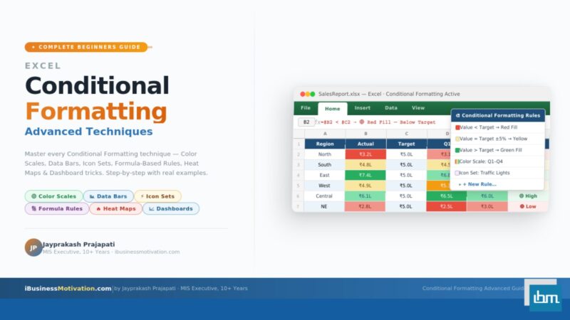


Open any Excel report and you will almost certainly see it: a sea of numbers in identical black text, sitting in white cells, row after row. Nothing stands out. The eye does not know where to go. Patterns are invisible. Outliers are buried.
Conditional Formatting is the Excel feature that fixes this problem entirely. It automatically changes how a cell looks – its colour, font, border, or icon – based on the value inside it or a formula you define. It transforms static data tables into living, visual dashboards that communicate instantly.
This guide is structured as a complete journey from beginner to advanced. Whether you have never applied a single rule before or you are comfortable with basic highlighting and want to unlock formula-based rules, heat maps, and dashboard techniques – this guide covers everything step by step, with real examples and visual mockups throughout.
Section 1: What Is Conditional Formatting and Why Does It Matter?
Conditional Formatting is a built-in Excel feature that applies automatic visual formatting – background colour, font colour, borders, icons, or data bars – to cells based on rules you define. The formatting is dynamic: when the data changes, the formatting updates automatically.
The word conditional is the key. The formatting only applies when a condition is true. If a sales figure drops below a target, the cell turns red. If an attendance rate hits 100%, the cell turns green. If an inventory count falls below the reorder level, an alert icon appears. None of this requires manual highlighting – it happens automatically, every time.
| Without Conditional Formatting | With Conditional Formatting |
| All cells look identical regardless of value | Critical values instantly stand out visually |
| Analyst must read every number to find outliers | Outliers are highlighted automatically |
| Report must be manually re-highlighted after data refresh | Formatting updates automatically when data changes |
| No visual sense of scale or distribution | Color scales and data bars show relative magnitude |
| Dashboard requires manual formatting every cycle | Set once, runs forever on live data |
Section 2: How to Apply Your First Conditional Formatting Rule
Before diving into advanced techniques, let us apply a simple rule so you understand the workflow. This same workflow applies to every type of rule – only the options change.
Step-by-Step: Highlight Sales Below Target
- Select the range you want to format – for example, B2:B50 (your sales column).
- Go to the Home tab in the Excel ribbon.
- Click Conditional Formatting in the Styles group.
- Hover over Highlight Cells Rules.
- Click Less Than from the submenu.
- In the dialog box, type your target value – for example, 50000.
- Choose a format from the dropdown – for example, Red Fill with Dark Red Text.
- Click OK.
Every cell in column B with a value below 50,000 immediately shows a red background with dark red text. When a salesperson’s number improves above 50,000, the red highlighting disappears automatically on the next data refresh or manual update.
The Six Built-In Highlight Cells Rules
| Rule Type | What It Highlights | Best Use Case |
| Greater Than | Values above a threshold you set | Sales above target, high scores |
| Less Than | Values below a threshold you set | Sales below quota, low stock |
| Between | Values within a range you define | Values within acceptable tolerance |
| Equal To | Exact matches to a value or text | Status = Complete, Region = North |
| Text That Contains | Cells containing a specific word or string | Flag notes containing ‘Urgent’ |
| Duplicate Values | Cells that are repeated or unique in the range | Find duplicates in ID columns |
| A Date Occurring | Dates that are today, yesterday, last week, etc. | Overdue tasks, upcoming deadlines |
Top and Bottom Rules
Top/Bottom Rules automatically highlight the best or worst performers in a dataset without you needing to know the actual values. Excel calculates the threshold dynamically based on your data.
| Rule | What It Does |
| Top 10 Items | Highlights the highest N values (you set N) |
| Top 10% | Highlights the top percentage of values |
| Bottom 10 Items | Highlights the lowest N values |
| Bottom 10% | Highlights the bottom percentage of values |
| Above Average | Highlights all values above the mean of the range |
| Below Average | Highlights all values below the mean of the range |
Pro Tip: Change the Number Top 10 Items does not have to be 10. When you click the rule, a dialog lets you change the number to any value – Top 3, Top 25, whatever your report needs. The word ‘Items’ just means ‘rows’, not a fixed count of 10.
Section 3: Color Scales, Data Bars, and Icon Sets – Visual Indicators Explained
These three tools go beyond simple pass/fail highlighting. They show relative values across an entire range, making it easy to spot distribution, outliers, and patterns at a glance – without reading a single number.
Color Scales – Heat Map in One Click
A Color Scale applies a gradient of two or three colours across a range, where each cell’s colour represents its relative position between the minimum and maximum values in the range. The most popular is the Red-Yellow-Green scale: red for the lowest values, yellow for the middle, and green for the highest.

How to apply a Color Scale: Select your data range, go to Conditional Formatting, hover over Color Scales, and click the Red-Yellow-Green preset (or any other). Excel applies it instantly.
Data Bars – In-Cell Bar Chart
Data Bars display a proportional horizontal bar inside each cell, sized relative to the highest value in the range. The result looks like a miniature bar chart embedded directly in your data – without creating a separate chart object.
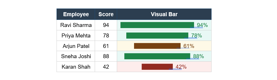
How to apply Data Bars: Select your numeric range, go to Conditional Formatting > Data Bars, choose Gradient Fill or Solid Fill, and select a colour. Done.
Advanced Data Bar Tip: By default, negative values are shown in the same direction as positive values, which can be confusing. To fix this, go to Conditional Formatting > Manage Rules > Edit Rule > Negative Value and Axis settings. Set negative values to display in red, going in the opposite direction. This is essential for P&L or variance reports.
Icon Sets – Status Indicators at a Glance
Icon Sets place a small icon in each cell based on the value’s position within the range. The most commonly used are Traffic Lights (red/yellow/green circles), Arrows (up/flat/down), and Star ratings (1 to 5 stars). They are ideal for status dashboards, project trackers, and KPI reports.
How to apply Icon Sets: Select your range, go to Conditional Formatting > Icon Sets, and pick a style. By default, Excel divides the range into thirds. To customize the thresholds, go to Manage Rules > Edit Rule and set your own percentage, number, or formula boundaries for each icon.
Section 4: Formula-Based Conditional Formatting – The Most Powerful Technique
The built-in preset rules cover many common situations. But the real power of Conditional Formatting is unlocked when you write your own formulas. Formula-based rules give you complete control: you can apply formatting based on any logical condition, any combination of columns, or even values from a completely different part of your workbook.
How Formula-Based Rules Work: When you choose ‘Use a formula to determine which cells to format’, you enter a formula that returns either TRUE or FALSE. When the formula returns TRUE for a cell, the formatting is applied to that cell. When it returns FALSE, no formatting is applied. The formula is evaluated separately for every cell in your selected range.
How to Apply a Formula-Based Rule – Step by Step
- Select the range you want to format – for example, A2:F100 (your entire data table).
- Go to Home > Conditional Formatting > New Rule.
- In the New Formatting Rule dialog, click Use a formula to determine which cells to format.
- In the formula box, type your formula.
- Click the Format button and choose your desired formatting (fill colour, font, border).
- Click OK twice to apply.
Critical Rule: Anchor the Right Columns: Formula-based rules use the same $ referencing as regular formulas. For whole-row highlighting, you must lock the column ($A2) but leave the row free. If you accidentally lock the row ($A$2), every row in the range will check only row 2, giving wrong results. Always start your formula from the top-left cell of your selected range.
Formula Example 1: Highlight Entire Row When Status Is ‘Overdue’
Scenario: You have a task tracker. Column D contains the status of each task. You want to highlight the entire row red when column D says ‘Overdue’.
Select the entire table range (e.g., A2:F100) and enter this formula:
=$D2="Overdue"The $ before D locks the column – so every cell in the row checks column D. The 2 is unlocked, so it moves down row by row. Format: red background fill.
Formula Example 2: Highlight Rows Where Sales Miss Target
Scenario: Column B holds actual sales. Column C holds the individual target for each salesperson. Highlight the entire row orange when actual sales are below target.
=$B2<$C2This compares two columns for each row. If B is less than C for a given row, the entire row turns orange. Both columns are locked with $ but rows are free to move.
Formula Example 3: Highlight Upcoming Deadlines (Next 7 Days)
Scenario: Column E contains due dates. You want to highlight rows where the deadline falls within the next 7 days from today.
=AND($E2>=TODAY(), $E2<=TODAY()+7)AND checks two conditions simultaneously: the date must be today or later (not overdue), AND it must be within 7 days. TODAY() is a dynamic function – the rule re-evaluates every day automatically.
Formula Example 4: Alternate Row Shading (Zebra Stripes)
Zebra striping – alternating light and white rows – dramatically improves readability in long tables. Instead of manually formatting every other row, this single formula handles it across any number of rows:
=MOD(ROW(),2)=0MOD(ROW(),2) returns 0 for even row numbers and 1 for odd row numbers. So this rule applies the formatting only to even rows, creating the alternating pattern automatically. Change =0 to =1 to shade odd rows instead.
Formula Example 5: Highlight Duplicates in a Specific Column
Scenario: Column A contains Employee IDs and you want to visually flag any duplicate IDs (the built-in duplicate rule checks the whole cell; this formula gives you column-level control).
=COUNTIF($A$2:$A$100,$A2)>1COUNTIF counts how many times the value in the current row appears in the full column range. If it appears more than once, the condition is TRUE and the cell is highlighted. Apply to just column A or to the full row.
Formula Example 6: Highlight Blank Cells in Required Fields
Scenario: Columns B, C, and D are mandatory. Highlight any row where any of these three fields is empty, so data entry gaps are immediately visible.
=OR($B2="", $C2="", $D2="")OR returns TRUE if any one of the conditions is true – so the row gets highlighted if any required field is blank. Perfect for data validation dashboards.
| Formula Pattern | What It Does | Key Technique |
| =$D2=”Overdue” | Exact text match in column D | Lock column with $, free row |
| =$B2<$C2 | Compare two columns | Lock both columns with $ |
| =AND($E2>=TODAY(),$E2<=TODAY()+7) | Date within next 7 days | Use TODAY() for dynamic dates |
| =MOD(ROW(),2)=0 | Alternate row shading | MOD with ROW() |
| =COUNTIF($A$2:$A$100,$A2)>1 | Highlight duplicates | Absolute range, relative row |
| =OR($B2=””,$C2=””,$D2=””) | Flag rows with any blank | OR across multiple columns |
| =$F2>AVERAGE($F$2:$F$100) | Highlight above-average values | Dynamic AVERAGE reference |
| =WEEKDAY($C2,2)>5 | Highlight weekend dates | WEEKDAY returns 6=Sat, 7=Sun |
Section 5: Creating a Heat Map with Conditional Formatting
A heat map is a visual grid where each cell’s background colour represents its value – darker or more saturated colours indicate higher (or lower) values, depending on your colour scheme. Heat maps are ideal for showing patterns across two dimensions simultaneously: for example, sales performance by region AND by month in a single grid.
Step-by-Step: Sales Heat Map by Region and Month
- Build your data grid: put months across row 1 (B1 to M1) and regions down column A (A2 to A5).
- Fill in the sales values in the grid cells B2:M5.
- Select the entire data area B2:M5 (exclude headers).
- Go to Conditional Formatting > Color Scales.
- Choose the Green-Yellow-Red scale (or reverse it to Red-Yellow-Green if you want higher to be green).
- Click OK.
The lowest-performing region-month combinations turn red. Average performance cells turn yellow. The best-performing cells turn green. Patterns jump out immediately – you can see at a glance which region struggles in Q1, which peaks in Q3, and where the business needs attention.
Customising a Heat Map – Go Beyond Presets
The preset colour scales have fixed midpoints. For more control, go to Conditional Formatting > Manage Rules > Edit Rule. This opens the Edit Formatting Rule dialog for color scales, where you can:
- Set the Minimum, Midpoint, and Maximum to specific numbers, percentages, or percentile thresholds instead of the automatic min/max.
- Change any of the three colours to match your brand or report style.
- Choose whether the midpoint colour appears at the average, median, or a specific value you define.
- Apply the scale to only part of a range – useful when one outlier would skew the entire colour gradient.
Advanced Dashboard Techniques with Conditional Formatting
Professional Excel dashboards combine Conditional Formatting with other Excel features to create fully automated, visually rich reporting tools that update themselves. Here are the most impactful techniques:
Technique 1: KPI Traffic Light Dashboard
A KPI dashboard typically shows a list of metrics with a red/amber/green traffic light status indicator. You can build this entirely with Icon Sets using a custom formula threshold.
- Create a KPI table with columns: KPI Name, Actual, Target, and Status.
- In the Status column, enter a formula: =B2/C2 (the ratio of actual to target).
- Apply an Icon Set to the Status column: Three Traffic Lights.
- Edit the rule thresholds: Green when value >= 0.9, Yellow when >= 0.75, Red when < 0.75.
- Now hide the ratio numbers: format the Status cells as ;;; (custom number format that shows nothing). Only the icon remains visible.
Clean Tip: Show Only Icons: To display just the traffic light icon without the underlying number, edit the Icon Set rule and check the box that says ‘Show Icon Only’. This removes the number and leaves only the icon – giving you a clean, professional KPI indicator.
Technique 2: Dynamic Gantt Chart with Conditional Formatting
A basic Gantt chart can be built using formula-based Conditional Formatting without a single chart object. The idea is to shade cells in a timeline grid when the column date falls between a task start and end date.
- Set up your task list in column A, Start Date in column B, End Date in column C.
- Create a date header row across columns D onwards (D1, E1, F1… representing each day or week).
- Select the entire timeline grid (D2 to the last date column, down all task rows).
- Apply a formula-based rule:
=AND(D$1>=$B2, D$1<=$C2)- Format with a solid blue or green fill.
This formula checks: is the column header date (D1, locked by row: D$1) between this task’s start date ($B2, locked by column) and end date ($C2, locked by column)? If yes, shade the cell – creating the Gantt bar automatically across the correct columns.
Technique 3: Highlight the Current Row and Column (Crosshair Effect)
When reviewing large tables, a crosshair effect highlights the entire row and column of the selected cell, making it much easier to track which row and column you are reading. This combines Conditional Formatting with a cell reference and VBA, but the formatting itself is entirely formula-based.
For the row highlight, enter a named range called ActiveRow that holds the row number of the selected cell. Then apply this formula to your entire table:
=ROW()=ActiveRowAnd for the column highlight:
=COLUMN()=ActiveColumnThe crosshair effect requires a small VBA macro to update the named ranges ActiveRow and ActiveColumn when the selection changes. But the Conditional Formatting formula rules themselves are pure Excel – no VBA formatting code required.
Section 6: Managing, Editing, and Clearing Conditional Formatting Rules
As you build more complex reports, you will accumulate multiple rules on the same range. Knowing how to manage these rules cleanly is essential.
The Manage Rules Dialog
To see, edit, prioritise, or delete all rules on a range: go to Conditional Formatting > Manage Rules. This dialog shows every rule applied to the currently selected range (or the entire sheet if you choose ‘This Worksheet’ from the dropdown).
| Action | How to Do It | When to Use It |
| Edit a rule | Select the rule and click Edit Rule | Change threshold values, colours, or formulas |
| Delete a rule | Select the rule and click Delete Rule | Remove formatting you no longer need |
| Change rule priority | Select rule and click the Up/Down arrows | When multiple rules conflict on the same cell |
| Stop if true | Check the ‘Stop If True’ checkbox | Prevent lower-priority rules from applying if a higher rule matches |
| Clear from selection | Conditional Formatting > Clear Rules > From Selected Cells | Remove all rules from a specific range |
| Clear from sheet | Conditional Formatting > Clear Rules > From Entire Sheet | Remove all conditional formatting from the whole sheet |
When multiple rules apply to the same cell, Excel processes them in order from top to bottom in the Manage Rules dialog. The first rule that matches wins – unless Stop If True is unchecked, in which case multiple matching rules can all apply simultaneously (layering their formatting).
Performance Warning: Applying too many formula-based Conditional Formatting rules to very large ranges (100,000+ cells) can significantly slow down Excel recalculation. Best practice: limit the applied range to only the rows that actually contain data, not entire columns like A:A. Use defined table ranges instead.
Section 7: Common Conditional Formatting Mistakes and How to Avoid Them
| Mistake | Why It Happens | How to Fix It |
| Formatting applies to wrong rows | $ anchoring is incorrect in formula | Lock column ($A2), leave row free – not $A$2 |
| Only first row gets formatted | Applied to A1:F1 instead of A1:F100 | Recheck the selected range before applying |
| Color scale ignores outlier patterns | One extreme value dominates the scale | Edit rule and set min/max to percentile (5th/95th) instead of automatic |
| Rule conflicts with another rule | Two rules match the same cell with different colours | Open Manage Rules and set the correct priority order |
| Formula-based rule returns wrong result | Text comparison is case-sensitive | Use LOWER() or UPPER() to make text comparisons case-insensitive: =LOWER($D2)=”overdue” |
| Formatting disappears after paste | Paste overwrites cell formatting including CF rules | Use Paste Special > Values Only (Ctrl+Shift+V) to preserve formatting |
| Dashboard icons are showing numbers instead of only icons | Show Icon Only option is not enabled | Edit the Icon Set rule and check Show Icon Only |
| Rule applies to entire column, slowing Excel | Range set to A:A or B:B (whole column) | Limit range to A2:A1000 or the actual data range |
8 Pro Tips for Advanced Conditional Formatting
- Copy Conditional Formatting to other ranges using Format Painter (Home tab). This copies all rules exactly, including formula anchoring – far faster than recreating rules manually.
- Use named ranges in your formulas for cleaner, more readable rules. Instead of =$D2=”Overdue” you could name column D ‘Status’ and write =Status=”Overdue”.
- Combine Conditional Formatting with Excel Tables (Ctrl+T). Table ranges expand automatically when you add rows, so your CF rules cover new data without manual adjustment.
- Use INDIRECT() in your CF formula to reference a cell that controls the threshold value. This lets users change the threshold from a visible cell without editing the rule: =$B2>INDIRECT(“TargetCell”).
- Apply icon sets to non-visible helper columns to create dashboard indicators without cluttering your main data. Show the icon column at a narrow width so only the icon is visible.
- Test formula-based rules by first entering the formula in a blank cell to confirm it returns TRUE or FALSE correctly for your test cases before applying it as a rule.
- Use conditional formatting with Print Preview. Coloured cells print as grey shades in black-and-white printing. Test your report in Print Preview with a colour printer setting to confirm the visual hierarchy survives printing.
- Stack multiple colour scale rules to create a custom multi-tier highlight: one rule for top 10% (dark green), another for bottom 10% (dark red), and icon sets for the middle tier – all on the same range simultaneously.
Frequently Asked Questions About Conditional Formatting
It can, if applied carelessly. Rules applied to entire columns (A:A) or very large ranges with complex formulas recalculate with every edit. Best practice is to limit ranges to the actual data area and avoid volatile functions like NOW() or OFFSET() inside CF formulas unless absolutely necessary.
Yes, but with limitations. You can apply CF rules to PivotTable value cells. However, when the PivotTable is refreshed or fields are reorganised, the CF range may need to be reapplied. For dynamic PivotTable dashboards, it is better to use a Color Scale applied to the entire value area rather than formula-based rules.
Yes – this is one of the most powerful uses of formula-based rules. For example, to highlight column B based on the value in column D of the same row, select B2:B100 and apply the formula =$D2>100. The key is using the correct $ anchoring so the formula looks at column D but moves down each row.
Direct cross-sheet references in CF formulas are not natively supported in standard Excel. The workaround is to use a named range that references the other sheet, then use that named range in your CF formula. Alternatively, pull the value from the other sheet into a helper cell on the current sheet and reference that helper cell.
Excel does not have a strict published limit on the number of CF rules per sheet or per cell. However, practical performance degrades noticeably beyond a few hundred complex formula-based rules on large ranges. Keep rules focused and delete obsolete rules regularly using Manage Rules.
Not directly with built-in Conditional Formatting – Excel CF rules work with values, not cell fill colours. However, you can use VBA to read cell colours and apply formatting programmatically. For purely formula-based solutions, use a consistent value or text in a helper column to represent the status that the colour represents, and apply CF to that column instead.
Summary: Your Conditional Formatting Mastery Roadmap
You have now covered the complete spectrum of Conditional Formatting – from applying your first simple highlight rule to building dynamic heat maps, Gantt charts, and KPI dashboards. Here is a quick reference roadmap based on your current level:
| Level | Skills Covered | Apply It To |
| Beginner | Highlight Cells Rules, Top/Bottom Rules | Sales reports, attendance sheets, simple trackers |
| Intermediate | Color Scales, Data Bars, Icon Sets | Performance dashboards, KPI scorecards, comparison tables |
| Advanced | Formula-based rules, whole-row highlighting, date formulas | Operations trackers, data validation dashboards, MIS reports |
| Expert | Heat maps, Gantt charts, crosshair effects, stacked rules | Executive dashboards, automated weekly reports, BI-style workbooks |
Conditional Formatting is not just a visual tool – it is a communication tool. It takes the burden of analysis off the reader and puts it directly into the data itself. Used well, it turns an ordinary Excel table into a self-explanatory report that anyone in your organisation can read and act on immediately.
The next time you build a report, start by asking: what does the reader need to notice first? Then apply the appropriate Conditional Formatting rule to make that thing impossible to miss.
Free Excel Tools at ibusinessmotivation.com: Need to merge, clean, or split your Excel files before applying Conditional Formatting? Visit ibusinessmotivation.com for free browser-based tools: Multiple Excel File Merger, Excel Data Cleaner, and Excel Worksheet Split Tool – no signup, no software installation required.