

Every data scientist learns Python. Every data scientist learns R. But here is a truth that university courses rarely admit: a huge portion of real-world data work still happens inside Microsoft Excel. Data arrives in .xlsx files. Stakeholders want dashboards they can click through. Reports live in spreadsheets. And the first look at any new dataset – cleaning it, profiling it, spotting anomalies – almost always starts in Excel.
This guide is for data scientists at every stage – from students learning their first dataset to working analysts who want to sharpen their Excel toolkit. You will learn how Excel fits into the modern data science workflow, which Excel features every data scientist must master, how to perform exploratory data analysis (EDA) with native Excel tools, statistical functions that replace basic Python calculations, and how to build dashboards that communicate findings clearly to non-technical stakeholders.
Excel is not a replacement for Python, R, or SQL. But it is the most universally accessible data tool in existence – and knowing it deeply makes you a more complete and more employable data professional.
Where Excel Fits in the Modern Data Science Workflow
A common misconception among data science students is that Excel is a beginner tool to be replaced as quickly as possible by Python or R. In practice, the reality is more nuanced. Excel occupies a specific and valuable role in the data science workflow – one that complements rather than competes with programming languages.
| Stage of Data Work | Excel’s Role | Better Alternative When… |
| Receiving raw data | First look – open, scroll, understand structure | Files > 1M rows or multiple joined tables |
| Data profiling | Count rows, check nulls, find min/max quickly | Automated profiling at scale (pandas-profiling) |
| Data cleaning | Remove duplicates, fix formats, fill blanks | Repeatable pipelines on large structured data |
| Exploratory Analysis | PivotTables, charts, quick summaries | Statistical depth, ML-ready feature analysis |
| Statistical testing | AVERAGE, STDEV, CORREL, regression | Hypothesis testing beyond basic stats |
| Data visualization | Charts, sparklines, conditional formatting | Publication-quality or interactive dashboards |
| Stakeholder reporting | Dashboards, formatted tables, slicers | Real-time or web-based interactive reports |
| Sharing findings | .xlsx files universally openable | Reproducible notebooks (Jupyter) for technical teams |
The Data Scientist’s Mindset on Excel: Think of Excel as your first responder tool. When data lands on your desk, Excel lets you understand it in 10 minutes without writing a single line of code. That speed of exploration has genuine value, especially when working with business stakeholders who think in spreadsheets.
Essential Excel Skills Every Data Scientist Must Know
Not all Excel features are equally relevant to data science work. These are the non-negotiable skills – the ones that appear in real data projects again and again.
Data Sorting and Filtering
Sorting and filtering are the most fundamental data exploration actions. But data scientists need to use them precisely, not casually. Key techniques include multi-level sorting (sort by Region, then by Date, then by Sales), using Custom Sort to apply specific sort orders, and using Advanced Filter to extract records matching complex criteria into a separate location – a lightweight alternative to SQL WHERE clauses.
Critical Rule for Data Scientists: Never sort raw data in-place without keeping a backup or an original row-number column. Sorting is irreversible unless you have a way to restore original order. Always add a helper column with row numbers (1, 2, 3…) before sorting.
Named Ranges and Structured Tables
Converting your data range into a structured Table (Ctrl+T) is one of the highest-impact habits a data scientist can build in Excel. Tables give you automatic column headers in formulas, dynamic range expansion when new rows are added, structured reference syntax like Table1[Revenue] instead of fragile range addresses, and built-in filtering and sorting controls on every column.
Named Ranges let you reference data by meaningful names in formulas. Instead of =VLOOKUP(A2, $D$2:$F$500, 2, FALSE), you write =VLOOKUP(A2, ProductLookup, 2, FALSE). This makes complex analytical formulas far more readable and maintainable.
Core Lookup Functions: XLOOKUP, INDEX-MATCH, VLOOKUP
Data science work constantly requires joining data from different tables – matching customer IDs to names, product codes to prices, employee IDs to departments. Excel handles this with lookup functions. XLOOKUP is the modern standard and covers 90% of lookup needs. INDEX-MATCH remains essential for older Excel versions and more complex two-way lookups. VLOOKUP is still widely used in existing workbooks and must be understood for maintenance.
-- Lookup Formulas
' Match customer ID to their segment - XLOOKUP
=XLOOKUP(A2, CustomerTable[CustID], CustomerTable[Segment], "Unknown")

' Two-way lookup: Revenue for Region+Quarter - Nested XLOOKUP
=XLOOKUP(F2, A2:A13, XLOOKUP(G2, B1:E1, B2:E13))

' INDEX-MATCH - works in all Excel versions
=INDEX(CustomerTable[Segment], MATCH(A2, CustomerTable[CustID], 0))
Text Functions for Data Cleaning
Real-world data is messy. Customer names have extra spaces. Product codes are mixed case. Dates arrive as text strings. Excel’s text functions are the first line of defense for cleaning this data before analysis.
| Function | What It Does | Data Science Use Case |
| TRIM | Removes leading, trailing, and double spaces | Fix messy imported customer names and addresses |
| CLEAN | Removes non-printable characters | Fix data exported from legacy ERP systems |
| UPPER / LOWER / PROPER | Standardize text case | Normalize category names before grouping |
| LEFT / RIGHT / MID | Extract substring from a position | Extract department code from employee ID string |
| FIND / SEARCH | Locate position of a character in text | Find the @ in an email, or dash in a product code |
| SUBSTITUTE / REPLACE | Replace specific text within a string | Remove currency symbols, fix inconsistent delimiters |
| TEXT | Convert number to formatted text | Format dates or numbers for report labels |
| TEXTJOIN | Concatenate range with a delimiter | Combine tags or attributes into a single field |
| TEXTSPLIT (365) | Split text by a delimiter into array | Parse comma-separated tags into separate columns |
Data Cleaning in Excel – The Data Scientist’s Workflow
Data cleaning is where data scientists spend the majority of their time. Excel handles a surprisingly large portion of common cleaning tasks efficiently. Here is the complete step-by-step data cleaning workflow for Excel.
Step 1: Profile Your Raw Data
Before cleaning anything, understand what you have. For each column, calculate basic statistics to detect problems:
-- Data Profiling Formulas
' Count of non-blank values (how complete is the column?)
=COUNTA(A2:A10000)

' Count of blank values (nulls / missing data)
=COUNTBLANK(A2:A10000)

' Count of unique values (cardinality check)
=SUMPRODUCT(1/COUNTIF(A2:A10000, A2:A10000))

' Check for duplicates - marks TRUE if value is a duplicate
=COUNTIF($A$2:$A2, A2) > 1
Remove Duplicates
Go to Data tab > Remove Duplicates. Select the columns that define a unique record. Excel will tell you how many duplicates were removed and how many unique records remain. For data science work, always perform this on a copy of the data – never on the original.
Standardize Data Types
Mixed data types in a column are a common problem in datasets imported from different sources. Use these techniques to standardize them:
- Convert text-formatted numbers: Select column > Data > Text to Columns > Finish. This forces Excel to re-parse values.
- Convert date strings to real dates: Use DATEVALUE() to convert text like ’25-01-2024′ into an actual Excel date serial number.
- Standardize categories: Use SUBSTITUTE and PROPER to normalize text values before grouping or analysis.
Handle Missing Values
Missing values require different treatment depending on your analysis goals. Excel gives you several options:
-- Missing Value Handling
' Replace blanks with column average (mean imputation)
=IF(A2="", AVERAGE(A$2:A$10000), A2)

' Replace blanks with previous non-blank value (forward fill)
=IF(A2="", B1, A2)

' Flag rows with missing values in key columns
=IF(OR(A2="",B2="",C2=""), "INCOMPLETE", "OK")

' Count missing values across multiple columns
=SUMPRODUCT((A2:A100="")+(B2:B100="")+(C2:C100=""))
Important: Document Your Cleaning Steps
In data science, cleaning decisions are as important as modeling decisions. Use a separate ‘Cleaning Log’ sheet to record every transformation you apply – what column, what change, and why. This documents your methodology and makes your work reproducible.
Exploratory Data Analysis (EDA) with Excel
Exploratory Data Analysis is the process of understanding a dataset before modeling. It involves computing summary statistics, identifying distributions, spotting outliers, and discovering relationships between variables. Excel handles all of these tasks natively.
Summary Statistics with Excel Functions
| Statistic | Excel Formula | What It Tells You |
| Mean (Average) | =AVERAGE(range) | Central tendency – the typical value |
| Median | =MEDIAN(range) | Middle value – robust to outliers |
| Mode | =MODE.SNGL(range) | Most frequently occurring value |
| Standard Deviation | =STDEV.S(range) | Spread of data around the mean |
| Variance | =VAR.S(range) | Squared spread – used in statistical tests |
| Minimum | =MIN(range) | Smallest value – check for anomalies |
| Maximum | =MAX(range) | Largest value – check for anomalies |
| Range | =MAX(range)-MIN(range) | Total spread of the data |
| 25th Percentile (Q1) | =QUARTILE.INC(range,1) | Lower bound for IQR outlier detection |
| 75th Percentile (Q3) | =QUARTILE.INC(range,3) | Upper bound for IQR outlier detection |
| Skewness | =SKEW(range) | Asymmetry – positive = right tail, negative = left |
| Kurtosis | =KURT(range) | Tail heaviness – high kurtosis = more outliers |
| Count | =COUNT(range) | Number of numeric values in range |
| Correlation | =CORREL(range1, range2) | Linear relationship between two variables (-1 to 1) |
Outlier Detection Using IQR
The Interquartile Range (IQR) method is the standard statistical approach for identifying outliers. Excel makes this calculation straightforward:
-- IQR Outlier Detection
' Step 1: Calculate Q1, Q3, and IQR
Q1  = QUARTILE.INC(B2:B1000, 1)
Q3  = QUARTILE.INC(B2:B1000, 3)
IQR = Q3 - Q1

' Step 2: Calculate bounds
Lower Fence = Q1 - (1.5 * IQR)
Upper Fence = Q3 + (1.5 * IQR)

' Step 3: Flag outliers in each row
=IF(OR(B2 < Lower_Fence, B2 > Upper_Fence), "OUTLIER", "Normal")

' Step 4: Count outliers
=COUNTIF(C2:C1000, "OUTLIER")
Frequency Distribution and Histogram
Understanding how values are distributed is a core EDA task. Use Excel’s FREQUENCY function or the built-in Histogram chart to visualize distributions:
-- Frequency Distribution
' FREQUENCY returns how many values fall into each bin
' Enter as array formula (Ctrl+Shift+Enter) in older Excel
' In Excel 365, just press Enter - it spills automatically

Bins:   [10, 20, 30, 40, 50]
Result: =FREQUENCY(DataRange, BinRange)

' For a quick histogram: Insert > Charts > Statistical > Histogram
' Excel will automatically bin your data and draw the chart
Correlation Matrix for Multiple Variables
A correlation matrix shows the pairwise relationships between all numeric variables in your dataset. This is one of the most important EDA tools for feature selection in machine learning. Use the built-in Data Analysis ToolPak:
- Go to File > Options > Add-ins > Analysis ToolPak > Go > Check it > OK.
- Go to Data tab > Data Analysis > Correlation.
- Select your range of numeric columns as the Input Range.
- Choose Output Range on a new sheet.
- Click OK. Excel generates a full correlation matrix.
Interpreting the Correlation Matrix
Values close to 1.0 indicate strong positive correlation. Values close to -1.0 indicate strong negative correlation. Values near 0 indicate little linear relationship. For feature selection, drop variables with correlation > 0.85 with another variable (multicollinearity) before modeling.
Statistical Analysis Functions for Data Scientists
Excel’s statistical function library is more powerful than most data scientists realize. While it cannot replace R or Python for complex inference, it covers a wide range of analytical needs that arise in everyday data work.
Conditional Aggregation
SUMIF, COUNTIF, and AVERAGEIF are the workhorse functions for group-level analysis – the Excel equivalent of SQL GROUP BY or pandas groupby(). Their multi-condition variants (SUMIFS, COUNTIFS, AVERAGEIFS) handle complex filtering:
-- Conditional Aggregation
' Total sales for North region only
=SUMIF(RegionCol, "North", SalesCol)

' Count transactions above 10,000 in Q1
=COUNTIFS(AmountCol, ">10000", QuarterCol, "Q1")

' Average salary for Engineers in Mumbai
=AVERAGEIFS(SalaryCol, RoleCol, "Engineer", CityCol, "Mumbai")

' SUMPRODUCT - the Swiss Army knife of array aggregation
' Sum of sales only where Region=North AND Category=Electronics
=SUMPRODUCT((RegionCol="North")*(CategoryCol="Electronics")*SalesCol)
Statistical Tests with the Analysis ToolPak
The Analysis ToolPak add-in provides a full suite of statistical tests that cover most basic inferential statistics needs. Once enabled (as shown in Section 4.4), access them via Data > Data Analysis:
| Test | When to Use It | Key Output |
| t-Test: Two-Sample | Compare means of two groups (e.g., A/B test) | t-statistic, p-value, reject/accept null hypothesis |
| t-Test: Paired | Compare before/after measurements on same subjects | p-value for paired differences |
| ANOVA: Single Factor | Compare means of 3+ groups simultaneously | F-statistic, p-value – is any group mean different? |
| Regression | Model linear relationship between variables | Coefficients, R-squared, p-values, residuals |
| Correlation | Pairwise correlation matrix | Correlation coefficients for all variable pairs |
| Descriptive Statistics | Full summary stats for a dataset | Mean, median, mode, stdev, skewness, kurtosis |
| Histogram | Frequency distribution with bins | Bin counts and optional chart |
| Moving Average | Smooth time series data | Smoothed values for trend detection |
| Exponential Smoothing | Weight recent values more in forecasting | Smoothed forecast values |
| z-Test: Two Sample | Test means when population variance is known | z-statistic, p-value |
Regression Analysis in Excel
Linear regression is the backbone of predictive modeling. Excel’s regression tool in the Analysis ToolPak generates a complete regression output including the equation, R-squared, standard errors, and p-values for each coefficient:
-- Regression Functions
' For a simple linear regression via formula only:

' Slope (beta coefficient)
=SLOPE(Y_range, X_range)

' Intercept
=INTERCEPT(Y_range, X_range)

' R-squared (coefficient of determination)
=RSQ(Y_range, X_range)

' Predict Y for a new X value
=FORECAST.LINEAR(new_X, Y_range, X_range)

' For multiple regression: Use Data > Data Analysis > Regression
' and select multiple columns as the X Range
PivotTables – The Data Scientist’s Fast Summarization Engine
PivotTables are arguably the single most powerful feature in Excel for data scientists. They let you summarize, aggregate, cross-tabulate, and filter millions of rows of data interactively – without writing a single formula.
Creating a PivotTable for EDA
- Select any cell inside your clean data table.
- Go to Insert > PivotTable > New Worksheet.
- The PivotTable field panel appears. Drag fields into Rows, Columns, Values, and Filters areas.
- In Values, you can compute Sum, Count, Average, Min, Max, StdDev, and more by right-clicking and selecting Value Field Settings.
Right-click any value in the PivotTable > Show Values As to compute % of Total, Running Total, Difference From, or Rank – transforming raw sums into analytical insights without formulas.
PivotTable Use Cases for Data Scientists
| Analysis Task | PivotTable Setup | Data Science Application |
| Group-level summary | Rows=Category, Values=SUM(Sales) | Equivalent to pandas groupby().sum() |
| Cross-tabulation | Rows=Region, Columns=Product, Values=COUNT | Contingency table for chi-square test |
| Time-series grouping | Rows=Date (grouped by Month/Quarter) | Temporal patterns and seasonality detection |
| Distribution analysis | Rows=Score Band, Values=COUNT | Frequency table for histogram data |
| Ranking | Values=Revenue, Show As=Rank Largest | Top N analysis without RANK formula |
| Running total | Values=Revenue, Show As=Running Total | Cumulative analysis over time |
| % contribution | Values=Revenue, Show As=% of Grand Total | Share analysis by segment or category |
Calculated Fields in PivotTables
You can create new metrics inside a PivotTable without modifying your source data. Right-click the PivotTable > PivotTable Options > Fields, Items & Sets > Calculated Field. For example, create a Profit Margin field as =Profit/Revenue directly inside the pivot. This keeps your source data clean while enabling rich analysis.
Power Query – Excel’s Data Engineering Tool
Power Query is the most underused and most powerful feature in modern Excel. It is a complete ETL (Extract, Transform, Load) engine built directly into Excel, capable of connecting to databases, APIs, web pages, folders of files, and more. For data scientists, Power Query replaces manual data preparation with a repeatable, click-based pipeline.
What Power Query Can Do for Data Scientists
- Connect to SQL Server, MySQL, PostgreSQL, Oracle, and other databases directly – no ODBC setup required.
- Connect to REST APIs, web pages, JSON files, and XML files.
- Merge (JOIN) multiple tables using any key – equivalent to SQL JOIN or pandas merge().
- Append (UNION) multiple files from a folder – automatically process all monthly files in one query.
- Unpivot columns to rows – essential for converting wide-format data to long-format for analysis.
- Apply transformations that refresh automatically when source data updates – one click to refresh the entire pipeline.
A Typical Power Query Workflow for Data Scientists
- Go to Data > Get Data > From File / Database / Web – choose your source.
- Power Query Editor opens. Each transformation you apply is recorded as a step in the Applied Steps panel on the right.
- Apply transformations: Remove columns, Rename columns, Change data types, Filter rows, Replace values, Merge queries, Group by.
- Click Close & Load to push the clean data into an Excel table or directly into a PivotTable.
- Next time data updates, click Data > Refresh All. Every transformation re-runs in seconds.
Power Query vs Manual Cleaning
The critical advantage of Power Query over manual Excel cleaning is reproducibility. Manual cleaning is one-time work. Power Query builds a reusable pipeline. When you receive next month’s data file, your Power Query runs the same 20 cleaning steps automatically in under 5 seconds.
Data Visualization for Data Scientists in Excel
Visualization is how data scientists communicate findings to non-technical stakeholders. Excel’s chart engine, combined with PivotCharts, conditional formatting, and sparklines, gives you a complete visualization toolkit for reporting and dashboards.
Chart Types Every Data Scientist Should Know
| Chart Type | Best For | Data Science Application |
| Scatter Plot | Show relationship between two numeric variables | Visualize correlations, outliers, regression lines |
| Line Chart | Show change over time | Time series trends, model performance over epochs |
| Bar / Column Chart | Compare categories | Group comparisons, feature importance ranking |
| Histogram | Show value distribution | EDA distribution analysis, normal vs skewed |
| Box Plot | Show distribution with outliers | Comparing spread across multiple groups |
| Heat Map (Cond. Format) | Show matrix of values by color intensity | Correlation matrices, confusion matrices |
| Combo Chart | Overlay two different chart types | Revenue bars + Profit Margin line on same axis |
| Waterfall Chart | Show cumulative effect of positive/negative values | Feature contribution analysis, P&L attribution |
| Sparklines | Compact in-cell trend lines | Dashboard summary rows with embedded trends |
Building a Data Dashboard in Excel
A data dashboard combines PivotTables, PivotCharts, and Slicers into a single interactive reporting view. Here is the structure of a professional Excel dashboard:
- Create a dedicated Dashboard sheet – this is the only sheet stakeholders will see.
- Build all PivotTables on separate data sheets, not on the dashboard.
- Insert PivotCharts linked to each PivotTable and paste them onto the Dashboard sheet.
- Add Slicers (Insert > Slicer) and connect them to multiple PivotTables via Report Connections – one slicer click filters all charts simultaneously.
- Add a Timeline Slicer for date-based filtering of all charts at once.
- Remove all gridlines, headers, and row numbers from the Dashboard sheet for a clean look.
- Protect the Dashboard sheet to prevent accidental edits by stakeholders.
Excel vs Python – When to Use Which
This is the question every data scientist asks. The honest answer is: it depends on the task. Here is a practical decision framework:
| Criteria | Use Excel | Use Python/R |
| Dataset size | Under 500,000 rows | 500K+ rows or real-time streaming |
| Audience | Business stakeholders who live in Excel | Technical teams, ML engineers, researchers |
| Task type | EDA, reporting, dashboards, basic stats | ML modeling, NLP, deep learning, automation pipelines |
| Reproducibility needs | One-time or monthly reports | Automated daily/hourly pipelines |
| Data sources | Excel files, SQL (via Power Query) | APIs, NoSQL, cloud data lakes, streaming |
| Visualization needs | Business charts, interactive slicers | Custom plots, interactive web dashboards |
| Collaboration | Share .xlsx with any colleague | Version control, notebooks, Git repositories |
| Speed of delivery | Fast – no environment setup needed | Slower setup, faster execution at scale |
| Statistical depth | Descriptive stats, basic regression | Advanced inference, Bayesian, time series models |
The Right Mindset: AND, Not OR
The most effective data scientists are not Excel-only or Python-only – they use both. Excel for fast exploration and stakeholder communication. Python or R for scalable automation, advanced modeling, and production pipelines. These tools are complementary. Proficiency in both makes you significantly more valuable in any data role.
10 Pro Tips for Data Scientists Using Excel
- Use Ctrl+T to convert every dataset to a structured Table immediately on opening. Tables expand automatically, and structured references never break when rows are added.
- Learn Power Query before learning VBA. Power Query handles 80% of data transformation tasks with a visual interface and zero code – and the transformations are fully reproducible and refreshable.
- Build a personal formula library. Maintain a Notes sheet with your most-used complex formulas (SUMPRODUCT arrays, dynamic named ranges, correlation calculations) so you can copy-paste them into new projects instantly.
- Use Conditional Formatting as a heatmap on correlation matrices and numeric tables. This gives you an instant visual understanding of patterns without building a chart.
- Never use merged cells in data tables. Merged cells break sorting, filtering, PivotTables, and Power Query. Use Center Across Selection instead for visual centering without merging.
- Use the Name Manager (Ctrl+F3) to create dynamic named ranges with OFFSET or INDEX. Dynamic ranges automatically expand as your data grows, keeping your formulas and charts always up to date.
- Add a Data Dictionary sheet to every analytical workbook. Document each column name, data type, allowed values, and source. This is essential for reproducibility and team collaboration.
- Use Freeze Panes (View > Freeze Panes > Freeze Top Row) when working with large datasets so column headers remain visible while scrolling. Combine with Ctrl+End to jump instantly to the last populated cell.
- Use the UNIQUE and SORT functions (Excel 365) to quickly extract distinct values and sorted lists without helper columns or manual work. Combine with FILTER for instant dynamic subsets.
Learn keyboard shortcuts for EDA speed: Ctrl+Shift+End (select to last cell), Ctrl+D (fill down), Alt+= (AutoSum), F4 (repeat last action), Ctrl+1 (format cells dialog). These shortcuts collectively save hours per week.
Frequently Asked Questions: Excel for Data Scientists
Excel alone is generally not sufficient for a data science role. Most data science positions require at least Python or R, along with SQL. However, strong Excel skills are a significant advantage – they signal that you understand data structures, can work with business stakeholders, and can perform quick exploratory analysis without spinning up a full environment.
Excel can perform linear regression, logistic regression approximations, and basic clustering through manual formula implementation. There are also Excel add-ins like XLMiner that bring more ML capabilities. However, for serious machine learning work – neural networks, gradient boosting, cross-validation, hyperparameter tuning – Python with scikit-learn, TensorFlow, or PyTorch is the standard.
Excel has a hard limit of 1,048,576 rows per sheet (approximately 1 million rows). For most business datasets this is sufficient. For large datasets, use Power Query to aggregate data before loading it into Excel, or switch to Python/pandas which handles datasets of any size limited only by RAM.
Power Query and pandas serve similar purposes – both are data transformation engines. Power Query has a visual interface and requires no code, making it more accessible for non-programmers and faster for simple tasks. Pandas is more powerful, fully programmable, handles much larger data, and integrates with the full Python ecosystem. For data scientists, knowing both is ideal.
For most career paths, learning them in parallel is the most practical approach. Excel gives you immediate productivity on real business data. Python opens the door to machine learning and large-scale analytics. If you must choose a starting point, Excel is more immediately applicable in business environments, while Python is more important for long-term career growth in data science.
Microsoft 365 (subscription) is strongly recommended. It includes XLOOKUP, UNIQUE, FILTER, SORT, SEQUENCE, LET, LAMBDA, Power Query, and dynamic array functions – all of which are absent in Excel 2019 and earlier. These modern functions dramatically reduce formula complexity and enable approaches that were previously impossible or required VBA.
Summary: Excel as a Data Science Tool – What to Master First
Excel is not a toy. In the hands of a skilled data scientist, it is a fast, flexible, universally deployable data analysis platform that requires no environment setup, no package installation, and no technical prerequisites from your audience. The data scientists who dismiss it are often the ones struggling to communicate findings to business stakeholders who think in spreadsheets.
| Priority | Skill to Master | Why It Matters |
| 1 – Essential | Structured Tables + Named Ranges | Foundation for all other work – prevents fragile formulas |
| 2 – Essential | XLOOKUP + SUMIFS + COUNTIFS | Core data joining and conditional aggregation |
| 3 – Essential | PivotTables + PivotCharts | Fastest EDA and stakeholder reporting tool in Excel |
| 4 – High | Text + Date cleaning functions | Real data is always messy – these fix it |
| 5 – High | Power Query (ETL) | Reproducible data pipelines replace manual work |
| 6 – High | Analysis ToolPak (Stats) | Basic statistical testing without Python |
| 7 – Important | Dashboard design with Slicers | Stakeholder-ready interactive reports |
| 8 – Important | FREQUENCY + Outlier detection | Core EDA that every dataset needs |
| 9 – Advanced | Dynamic arrays (FILTER, UNIQUE, SORT) | Modern Excel – replaces many VBA macros |
| 10 – Advanced | Power Pivot + DAX | For very large multi-table data models |
The path forward is clear: master the essentials first, build consistent habits around structured tables and Power Query, and use Excel where it is strongest – fast exploration, stakeholder dashboards, and universal data sharing. Let Python handle what Excel cannot. Together, they form a data science toolkit that works at every stage of a professional career.
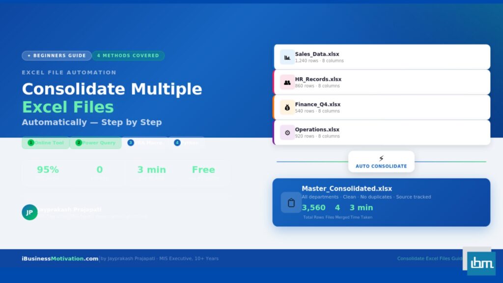
Free Excel Tools at ibusinessmotivation.com: If you need browser-based Excel automation for data preparation tasks – merging multiple data files, cleaning duplicates and formatting errors, or splitting data by column values – visit ibusinessmotivation.com for free tools that handle these tasks in minutes with no software installation required.