

Creating a clear, attractive, and interactive Excel dashboard is one of the most useful skills you can learn whether you’re a student, an analyst, a small-business owner, or a manager. This guide walks you through every step, from cleaning raw data to designing a user-friendly layout, adding interactive controls, and optimizing for speed.
Each section contains practical, copy-paste-ready formulas, clear explanations, and best practices so you can follow along and build your own dashboard confidently.
What is an Excel dashboard (and why you should build one)
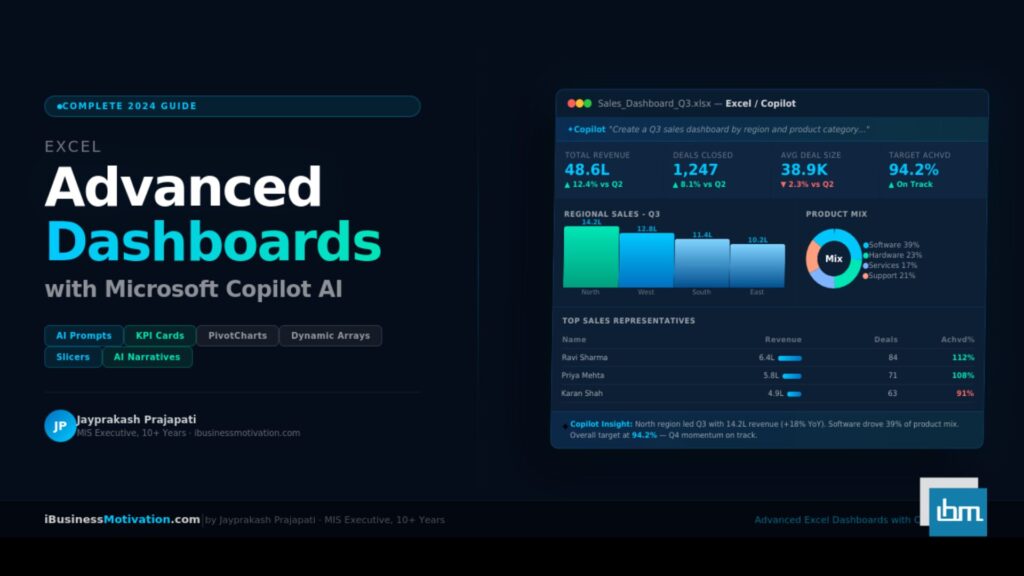
An Excel dashboard is a consolidated page (or set of pages) that visually displays the most important metrics and trends from your data. Think of it as a command center: key performance indicators (KPIs), charts, summaries, and filters are arranged so a user can quickly understand performance and make decisions.
Why build one?
- Faster decision-making: Stakeholders get the picture at a glance.
- Centralized reporting: No more hunting for files or multiple spreadsheets.
- Interactive exploration: Slicers and filters let anyone drill into details without changing formulas.
- Reusable templates: Once built, dashboards become a repeatable reporting asset.
This tutorial is focused on practicality: build a real dashboard while learning best practices so your dashboard is accurate, easy to update, and visually appealing.
Overview of the dashboard project we’ll build.
Throughout this tutorial we will create a simple but powerful Sales Performance Dashboard. It will include:
- Data import and cleaning (Power Query / manual techniques)
- A structured data model (raw vs. staging vs. reporting sheets)
- Key metrics (Total Sales, Average Order Value, Orders Count, YoY growth)
- Visuals: line chart, column chart, stacked chart, donut gauge, heatmap table
- Interactivity: slicers for Region, Product Category, and Date range
- A printable summary for executive review
- Performance tips and automation suggestions
You can use your own sales file or follow the sample dataset structure: Date, OrderID, Customer, Region, ProductCategory, Product, Quantity, UnitPrice, Discount, Sales (Quantity * UnitPrice * (1 – Discount)).
Step 1: Structure your workbook (best practice)
A clean workbook structure will save you hours later. Create these sheets:
Raw_Data: store original exported data (never edit directly)Staging(orCleaned): transformed data ready for analysisModelsummary tables, calculated columns, helper tables (if needed)Dashboardthe visual dashboard for usersData_Validation: lists for slicers (regions, categories)Archive: previous exports if you keep history
Why separate? It prevents accidental editing of raw data, makes refreshes easy, and keeps the dashboard layer stable.
Step 2: Import and clean data (Power Query recommended)
If your Excel supports Power Query (Get & Transform), use it. Power Query is powerful, repeatable, and safe.
Basic Power Query steps:
- Data → Get Data → From File → From Workbook/CSV.
In Power Query Editor:
- Remove empty columns and header rows.
- Rename columns to friendly names (Date, OrderID, Region…).
- Change data types (Date → Date, Sales → Decimal number).
- Trim and clean text (
Transform→Format→Trim/Clean). - Fill down or remove duplicates (Home → Remove Rows).
- Add custom columns if needed (e.g.,
Sales = Quantity * UnitPrice * (1 - Discount)using the Add Column → Custom Column).
- Close & Load To → choose
Only Create Connectionor load toStagingtable.
Power Query advantage: when you get new exports, replace the source file and click Refresh all transforms run automatically.
If you don’t have Power Query, use these manual steps:
- Paste raw data into
Raw_Data. - Convert to an Excel table: select data → Insert → Table. Name it
tblRaw. - Use helper columns in
Stagingthat referencetblRawcolumns using structured references like= [@Quantity] * [@UnitPrice] * (1 - [@Discount]). - Use Data → Remove Duplicates and Text → TRIM functions where needed.
Step 3: Normalize and create helper columns.
Helper columns make dashboard formulas readable and fast. Create them in the Staging table (or as calculated columns in Power Query):
Sales=Quantity * UnitPrice * (1 - Discount)
Example formula inside a table row:=[@Quantity]*[@UnitPrice]*(1-[@Discount])Year==YEAR([@Date])Month==TEXT([@Date],"mmm")(gives Jan, Feb…)MonthNum==MONTH([@Date])(for proper sorting)CustomerType(if mapping is needed) via VLOOKUP / XLOOKUP toData_Validationlist.OrderValueduplicatesSalesfor clarity or uses aggregated logic.
Best practice: keep these columns minimal and logical. Avoid heavy array formulas in raw/staging tables.
Step 4: Build the data model and summary tables.
Dashboards read from summarized tables, not raw rows. Create a Model sheet with these summary tables:
Date table:
Create a Date table that includes every date in your data range and columns Year, Quarter, MonthName, MonthNum, WeekNum, MonthYear (e.g., Jan 2025).
Why? Date tables allow consistent time-based grouping and are essential for time-intelligence formulas.
Create date table formula (assuming Excel with dynamic arrays or manually):
- Earliest date:
=MIN(Staging[Date]) - Latest date:
=MAX(Staging[Date]) - Build dates using sequence or fill down.
KPI summary Table:
This table should hold key metrics with simple formulas referencing the Staging table using SUMIFS or SUMPRODUCT.
Common KPIs:
Total Sales==SUM(Staging[Sales])Total Orders==COUNTA(UNIQUE(Staging[OrderID]))or=SUM(1/COUNTIF(Staging[OrderID],Staging[OrderID]))(but better to use a PivotTable for unique counts)Average Order Value==Total Sales / Total OrdersOrders This Month,Sales This MonthusingSUMIFSwith Date filters.
Example SUMIFS for Sales in 2025: =SUMIFS(Staging[Sales], Staging[Year], 2025)
If you have Excel 365, SUMIFS is straightforward and fast. If you have older Excel and huge data, use PivotTables.
PivotTables for grouped metrics:
Create PivotTables (Insert → PivotTable) from your Staging table for common breakdowns: Sales by Region, Sales by Product Category, Sales by Month, Top 10 Products.
PivotTables are fast, allow built-in grouping, and feed charts nicely.
Step 5: Design the dashboard layout (UX matters)
Before adding charts, sketch a layout. Good dashboard design principles:
- Place high-level KPIs at the top-left (most attention area).
- Group related visuals (e.g., time trends together, categorical breakdowns together).
- Use whitespace don’t cram charts.
- Keep color consistent: one accent color and one neutral palette.
- Use clear headings for each visual (short and actionable).
- Make controls (slicers, dropdowns) prominent and intuitive.
A suggested layout:
- Top row: KPIs (Total Sales, Orders, AOV, YoY Growth)
- Middle left: Sales trend (line chart)
- Middle right: Sales by Region (map or column chart)
- Lower left: Product Category breakdown (stacked column or donut)
- Lower right: Heatmap / table for product performance
- Top or side: Slicers for Region, Category, and Date Range
Step 6: Create KPIs with dynamic calculations.
KPIs should change when the user filters the dashboard. You can create dynamic KPI cells using GETPIVOTDATA if driven by PivotTables, or SUMIFS & FILTER for Excel 365.
Example dynamic KPI using SUMIFS and slicer input cells:
Assume you create helper cells where slicer choices are stored, or named ranges:
SelectedRegion(cell B1)SelectedCategory(cell B2)StartDate,EndDate(cells B3 and B4)
Then Total Sales formula that respects these filters:
=SUMIFS(Staging[Sales],
       Staging[Region], IF(SelectedRegion="All", Staging[Region], SelectedRegion),
       Staging[ProductCategory], IF(SelectedCategory="All", Staging[ProductCategory], SelectedCategory),
       Staging[Date], ">=" & StartDate,
       Staging[Date], "<=" & EndDate)
Note: Excel SUMIFS doesn’t accept arrays in criteria like this directly so an easier method is to use filterable pivot or helper columns marking rows in-scope. For beginners, use PivotTables with slicers to make KPIs dynamic without complex formulas.
Example: YoY Growth
YoY Growth = (ThisPeriodSales - LastPeriodSales) / LastPeriodSales
Calculate ThisPeriodSales and LastPeriodSales with SUMIFS using YEAR filters or with PivotTime grouping.
Step 7: Make charts (the visual layer)
Choose chart types thoughtfully. Here are practical steps for common visuals:
Sales trend (Line chart):
- Source: PivotTable grouped by Month or the Model monthly summary table.
- Insert → Line Chart.
- Add data labels sparingly.
- Format axis: show months, ensure proper ordered months (use MonthNum as axis value if needed).
- Add a trendline if helpful (Chart → Add Chart Element → Trendline).
Sales by Region (Clustered column):
- Source: PivotTable Region vs Sales.
- Sort regions by descending sales: right-click → Sort.
- Use data labels if space allows.
Product mix (Stacked column or 100% stacked):
- Use stacked columns to show category share over time (Months on X-axis, stacked by category).
- Alternatively, a donut chart for category share can be used; keep slices limited (combine small categories into “Other”).
KPI card visuals:
You can build KPI cards using cells with big fonts and conditional icons (▲ / ▼) to show growth. Use custom number formats and cell background fills rather than chart objects.
Heatmap table:
Create a table of Sales by Product vs Region, then apply Conditional Formatting → Color Scale to create a heatmap effect. This is excellent for spotting hotspots.
Step 8: Add interactivity with Slicers and Timeline
Slicers and timelines are the easiest way to make dashboards interactive without complex formulas.
- Use PivotTables as the backbone for charts.
- Insert PivotTable connected Slicers: select PivotTable → PivotTable Analyze → Insert Slicer → choose fields (Region, ProductCategory).
- Timeline for dates: PivotTable Analyze → Insert Timeline → choose Date. Timelines allow easy period selection (months, quarters).
- Connect slicers/timelin
- es to multiple PivotTables: Slicer → Options → Report Connections → check the PivotTables/charts to control.
Slicers make the dashboard user-friendly clicking a region instantly updates all connected visuals.
Step 9: Use named ranges and dynamic ranges.
Avoid hard-coded ranges. Use Excel tables (Insert → Table) or dynamic named ranges to ensure charts and formulas update when you add data.
- Convert
Stagingto a table namedtblSales. - Use structured references like
tblSales[Sales]in formulas. - For charts, set the chart’s data series to the table columns so new months or rows auto-extend.
Dynamic named range example (if not using tables):
Name: Dates
Refers to: =OFFSET(Model!$A$2,0,0,COUNTA(Model!$A:$A)-1,1)
But tables are easier and recommended.
Step 10: Formatting and visual polish.
Small design choices make dashboards readable:
- Font: Use a clean sans-serif (Calibri, Arial).
- Alignment: Right-align numbers, left-align labels.
- Colors: Pick 2–3 brand colors and neutrals. Keep bright colors only for highlights.
- Borders: Use light borders or subtle separators.
- Chart legends: Use clear, short text. If space is tight, use direct labels.
- Titles: Use action-focused headings like “Monthly Sales Last 12 Months”.
- Tooltips: Add cell comments or text boxes to explain metrics.
Accessibility: ensure contrast between text and background, and avoid relying on color alone to convey meaning.
Step 11: Add conditional formatting and alerts.
Conditional formatting helps users catch issues quickly.
- KPI Alerts: If
Total Sales< target, change cell background to red using Conditional Formatting → New Rule → Use a formula like=B2 < Target. - Top N highlighting: Use Top/Bottom rules to highlight top 10 products.
- Heatmap: Use Color Scales for matrix tables.
You can also use ICON SETS to visually indicate trend direction (up arrow, down arrow, neutral).
Step 12: Calculate targets and variances.
Dashboards often include targets and variance analysis. Add a Targets table in Data_Validation or Model with monthly or annual targets.
Variance formulas:
Variance=Actual - TargetVariance %=IF(Target=0, "", (Actual-Target)/Target)
Show these in KPI cards with color cues:
- Positive variance: green and ▲
- Negative variance: red and ▼
Example KPI card formula for variance percentage:
=IF(Target=0, NA(), (TotalSales - Target) / Target)
Format as percentage and display with conditional icon/text.
Step 13: Build drill-downs and detail views.
Dashboards should have a way to explore data deeper.
- Add a “Detailed View” sheet with PivotTables that connect to slicers.
- Use double-click on PivotTable values to see underlying rows automatically (PivotTable drill-through).
- Provide “Top 10” lists and a searchable product table using
FILTER(Excel 365) or advanced filters.
Example FILTER formula (Excel 365) to show all orders for selected product in B2:
=FILTER(tblSales, tblSales[Product]=B2, "No data")
For older Excel, use Advanced Filter or helper columns.
Step 14: Performance optimization (must-read for large data)
If your workbook feels slow, follow these tips:
- Use Excel Tables and PivotTables as much as possible (they are optimized).
- Avoid volatile formulas like
OFFSET,INDIRECT,NOW,TODAY,RAND. - Replace heavy array formulas with helper columns or Power Query transforms.
- Limit full-sheet conditional formatting; apply to specific ranges.
- Break big workbooks into source file and reporting file (use Data → Get Data from Workbook to pull necessary results).
- Disable unnecessary add-ins.
- Use
Manualcalculation mode while building: Formulas → Calculation Options → Manual. Remember to calculate (F9) before final checks.
Large data (>100k rows): Power Query + PivotCache is the most robust approach. Consider using Power Pivot / Data Model if available it handles millions of rows and creates relationships between tables.
Step 15: Automate refresh and distribution.
Make your dashboard repeatable:
- If you used Power Query, place new CSV exports in the same folder or point the query to the latest file, then Refresh All.
- Create a macro for one-click refresh and export to PDF/PowerPoint. Example simple macro:
Sub RefreshAndExport()
    ActiveWorkbook.RefreshAll
    Application.CalculateUntilAsyncQueriesDone
    Sheets("Dashboard").ExportAsFixedFormat Type:=xlTypePDF, Filename:=ThisWorkbook.Path & "\Dashboard.pdf", Quality:=xlQualityStandard, IncludeDocProperties:=True, IgnorePrintAreas:=False
End Sub
Use File → Share or OneDrive to share the workbook with stakeholders. Use Protect Sheet for the Dashboard page to prevent accidental editing.
Step 16: Common beginner mistakes (and how to avoid them).
- Editing raw data directly: Always keep a
Raw_Datasheet untouched. - Hard-coding ranges: Use tables to avoid broken charts and formulas.
- Too many visuals: More charts doesn’t mean better insight. Focus on essential KPIs.
- Poor sorting of time axis: Ensure months are sorted by month number, not alphabetically.
- Not validating data types: Dates stored as text break time grouping.
- Relying on manual steps: Use Power Query / PivotTables to make updates repeatable.
- Overuse of conditional formatting: Can slow down workbook and distract viewers.
- Ignoring performance: Large formulas, volatile functions, and full-sheet formatting slow Excel.
Step 17: Example mini walkthrough: Create a Monthly Sales chart from scratch.
- Ensure
tblSalestable exists and hasDateandSales. - Create a
Modeltable with unique MonthYear list (e.g.,=UNIQUE(TEXT(tblSales[Date],"yyyy-mmm"))in Excel 365) or use PivotTable grouping by date (group by Months). - If using Pivot: Insert → PivotTable → Add Date to Rows and Sales to Values → Right-click Date → Group → Months & Years.
- Insert → Charts → Line Chart.
- Format: remove gridlines, set axis, add data label for last point if desired.
- Connect chart to slicers by tying slicers to this PivotTable.
Step 18: Tips for sharing and making dashboards consumer-friendly.
- Add a short instruction box on the dashboard: “Use slicers to filter by Region and Category. Click timeline for date range.”
- Use
Data Validationdropdowns for simple filter choices if slicers are too much. - Lock the dashboard layout (Review → Protect Sheet) so slicers still work but charts and formulas aren’t accidentally edited.
- Export to PDF for executive distribution: File → Export → Create PDF/XPS.
- If distributing interactive workbooks, consider saving as
.xlsb(binary) smaller file size and faster load.
Frequently Asked Questions
Use Power Query whenever possible it’s repeatable and reduces manual errors.
Ensure the X-axis is using a date or month number (MonthNum) not the month name text, or use a Date/Month field from a Date table.
Use the Data Model and add the table to the model when creating the PivotTable, then use “Distinct Count” for values.
Remove volatile formulas, convert ranges to tables, use PivotTables and Power Query, and limit conditional formatting ranges.
Final Thoughts.
Building dashboards is a skill learned by doing. Start simple: import your data, create one PivotTable, add a line chart, then add one slicer. As you grow, add KPIs, conditional formatting, and deeper analysis. Revisit design and always ask: “What does the user need to make a decision?” That question should guide layout, visuals, and the level of detail.
If you’d like, I can now:
- Produce a downloadable Excel template for this Sales Dashboard (with sample formulas and tables).
- Walk you through building each element as you paste your actual dataset.
- Create a shorter version (one-page) for executives.
Tell me which you prefer, or paste a small sample of your data and I’ll tailor formulas and a layout directly to it.