

Every time a manager opens their inbox on Monday morning, they are looking for one thing: a clear, visual summary that tells them exactly how the business performed last week. Not 5,000 rows of raw data. A dashboard – one screen, all the answers.
Most Excel tutorials point beginners straight to Pivot Tables. And while Pivot Tables are powerful, they come with a learning curve, formatting limitations, and styling constraints that can make dashboards look rigid and hard to customize. Here is the truth: you do not need Pivot Tables to build a professional, fully dynamic Excel dashboard.
In this complete beginner’s guide, you will build a real Excel dashboard from scratch using formulas, charts, dropdowns, and conditional formatting. Every technique shown here works in Excel 2013 and all newer versions – including Microsoft 365.
Section 1: Why Build a Dashboard Without Pivot Tables?
Before diving into the build steps, it is worth understanding why many professionals prefer formula-based dashboards over Pivot Table dashboards – especially when sharing files with a wider team.
| Consideration | Pivot Table Dashboard | Formula-Based Dashboard |
| Learning curve | Moderate – requires understanding field placement and refresh | Low – standard Excel formulas anyone can read |
| Auto-refresh | Manual – must right-click and Refresh | Automatic – updates instantly when source data changes |
| Custom styling | Limited – Pivot Table styles override custom formatting | Full control – format any cell exactly as needed |
| Works on all Excel versions | Some features vary by version | Yes – SUMIF/COUNTIF work on Excel 2007+ |
| Understandable by others | Black box for non-Excel users | Transparent – anyone can trace a formula |
| Dynamic filtering | Requires Slicers (Excel 2010+) | Data Validation dropdowns – works everywhere |
| Best for | Large datasets needing drill-down | Clean, shareable executive dashboards |
Formula-based dashboards are not a workaround – they are a deliberate, professional choice. Many MIS executives use them precisely because they offer more control over layout, real-time updates, and easier auditing than Pivot Tables.
Section 2: Planning Your Dashboard – The 3-Layer Architecture
Every professional Excel dashboard is built on a clean three-layer architecture. If you skip this planning step and dump everything on one sheet, your dashboard will become impossible to maintain within weeks. Here is the structure that makes dashboards scalable:
| Layer | Sheet Name | What Goes Here | Editable by Users? |
| Layer 1 – Raw Data | RawData | All source data – sales records, orders, dates, regions. Never format this sheet. Never merge cells here. | Only to add new rows |
| Layer 2 – Calculation | CalcEngine | All SUMIF, COUNTIF, AVERAGEIF formulas. Hidden summaries. Lookup tables. This is the engine room. | No – formulas only |
| Layer 3 – Dashboard | Dashboard | The visual display – KPI cards, charts, dropdown filters, conditional formatting. What users actually see. | Dropdown selections only |
This separation means your raw data stays clean, your formulas stay organized and auditable, and your dashboard stays beautiful without getting cluttered with intermediate calculations.
Section 3: Setting Up the Raw Data Sheet
Open a new Excel workbook. Rename the first sheet RawData (right-click the tab > Rename). Your raw data should look like a clean database table – one row per transaction, one column per data point, no merged cells, no summary rows mixed in.
Sample Data Structure – Sales Records Table
| Order ID | Date | Region | Salesperson | Product | Units | Unit Price | Total Sales | Target |
| 1001 | 01-Jan-2024 | North | Ravi Sharma | Laptop | 3 | 45,000 | 1,35,000 | 1,20,000 |
| 1002 | 02-Jan-2024 | South | Priya Mehta | Mobile | 5 | 18,000 | 90,000 | 80,000 |
| 1003 | 03-Jan-2024 | East | Arjun Patel | Tablet | 2 | 22,000 | 44,000 | 50,000 |
| 1004 | 05-Jan-2024 | West | Sneha Joshi | Laptop | 1 | 45,000 | 45,000 | 40,000 |
| 1005 | 08-Jan-2024 | North | Karan Shah | Mobile | 4 | 18,000 | 72,000 | 70,000 |
Data Formatting Rules for a Clean Dashboard
Always format the date column as Date – not text. 2. Store numbers as numbers – no currency symbols inside cells. 3. Convert your data range to a formal Excel Table (Ctrl+T) so it auto-expands when new rows are added. 4. Use consistent region names – ‘North’ and ‘north’ are treated as different values by SUMIF.
Section 4: Building the Calculation Engine (CalcEngine Sheet)
Add a second sheet and name it CalcEngine. This is where all your formulas live. Users never see this sheet – you can hide it later. Building it separately keeps your Dashboard sheet clean and your formulas organized.
4.1 – Region Summary Table Using SUMIF and COUNTIF
This table calculates total sales, order count, and average order value for each region. Your dropdown on the Dashboard sheet will eventually pull from this calculation:
' In CalcEngine sheet - Region Summary Table

' Cell B2 (Total Sales - North):
=SUMIF(RawData!C:C, "North", RawData!H:H)

' Cell C2 (Order Count - North):
=COUNTIF(RawData!C:C, "North")

' Cell D2 (Average Order Value - North):
=AVERAGEIF(RawData!C:C, "North", RawData!H:H)

' Cell E2 (Target Achievement % - North):
=SUMIF(RawData!C:C, "North", RawData!H:H) / SUMIF(RawData!C:C, "North", RawData!I:I)

' Repeat the same for South, East, West in rows 3, 4, 5
4.2 – Month-Wise Summary Using SUMIFS (Multi-Condition)
SUMIFS lets you apply multiple conditions simultaneously – for example, total sales for the North region in January only. This powers the monthly trend chart:
' Total Sales - North Region, January 2024:
=SUMIFS(RawData!H:H,           ' Sum column: Total Sales
        RawData!C:C, "North",  ' Condition 1: Region = North
        RawData!B:B, ">="&DATE(2024,1,1),   ' Condition 2: Date >= Jan 1
        RawData!B:B, "<"&DATE(2024,2,1))    ' Condition 3: Date < Feb 1

' Shorter version using helper cells:
' Put start date in G1, end date in H1, region in I1
=SUMIFS(RawData!H:H, RawData!C:C, I1, RawData!B:B, ">="&G1, RawData!B:B, "<"&H1)
4.3 – Dynamic KPI Calculations Linked to Dropdown Selection
The real magic of a dynamic dashboard is that when the user changes the dropdown selection on the Dashboard sheet, all KPIs and charts update automatically. Here is how to set that up in the CalcEngine sheet:
' Assume Dashboard!B2 contains the dropdown-selected Region
' Assume Dashboard!B3 contains the dropdown-selected Month

' KPI 1 - Total Sales for selected Region:
=SUMIF(RawData!C:C, Dashboard!B2, RawData!H:H)

' KPI 2 - Total Orders for selected Region:
=COUNTIF(RawData!C:C, Dashboard!B2)

' KPI 3 - Average Order Value for selected Region:
=AVERAGEIF(RawData!C:C, Dashboard!B2, RawData!H:H)

' KPI 4 - Target Achievement % for selected Region:
=SUMIF(RawData!C:C, Dashboard!B2, RawData!H:H)
 / SUMIF(RawData!C:C, Dashboard!B2, RawData!I:I)

' Grand Total (all regions):
=SUM(RawData!H:H)

' Top Performing Region:
=INDEX({"North","South","East","West"},
 MATCH(MAX(SUMIF(RawData!C:C,{"North","South","East","West"},RawData!H:H)),
       SUMIF(RawData!C:C,{"North","South","East","West"},RawData!H:H),0))
After writing key formulas, name them using the Name Manager (Ctrl+F3). For example, name your Total Sales formula ‘TotalSales_Selected’. This makes your Dashboard formulas read like =TotalSales_Selected instead of =CalcEngine!B8 – much easier to audit and maintain.
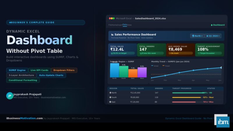
Section 5: Building the Dashboard Sheet – Step by Step
Add a third sheet and name it Dashboard. This is the sheet your users will see. Keep it clean: no gridlines, no row/column headers visible, a white or light gray background. Everything on this sheet should feel intentional.
Step 1: Remove Gridlines and Set Background
- Click View tab > uncheck Gridlines and Headings checkboxes.
- Select all cells (Ctrl+A) and fill with a light background – use #F5F7FA (very light gray) for a modern look.
- Add a title bar: select rows 1-3, fill with your brand color (e.g., #1F4E79 dark navy), type your dashboard title in white bold text.
Step 2: Add Dropdown Filter Controls
Data Validation dropdowns are how users interact with your dashboard. They are simple to build and work in all Excel versions:
- Click the cell where you want the Region dropdown (e.g., cell E2).
- Go to Data tab > Data Validation.
- In the Allow dropdown, select List.
- In the Source box, type: North,South,East,West (or reference a range).
- Click OK. The dropdown arrow appears in cell E2.
- Repeat for the Month dropdown in cell G2.
' Data Validation Source options:

' Option A - Type directly (quick):
North,South,East,West

' Option B - Reference a range (auto-updates when list changes):
=CalcEngine!$A$10:$A$13

' Option C - Named Range (cleanest):
=RegionList
' (define RegionList in Name Manager pointing to your region cells)
Step 3: Design the KPI Cards
KPI cards are the most visually impactful element of any dashboard. Each card shows one number with a label and a trend indicator. Here is how to build them manually without any special add-ins:
- Select a 4×2 cell block (e.g., B5:C6). Merge these cells to create the card space.
- Apply a colored fill (e.g., light blue #DDEEFF for Total Sales).
- Add a thick border using Format Cells > Border.
- In the top row of the card, type the label in small gray text: Total Sales.
- In the bottom row, enter the formula that pulls from CalcEngine: =CalcEngine!B8
- Format the number as currency with no decimals for clean display.
- Repeat for the 4 KPIs: Total Sales, Order Count, Avg Order Value, Target Achievement %.
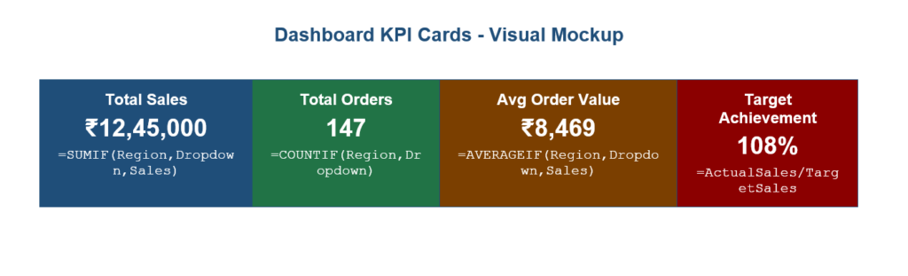
Step 4: Add Conditional Formatting – Traffic Light Indicators
Traffic light indicators (red, amber, green) tell users at a glance whether each KPI is on target. Here is how to add them to your Target Achievement card:
- Select the Target Achievement cell (e.g., H6).
- Go to Home > Conditional Formatting > New Rule.
- Choose Format cells that contain.
- Set three rules in order: Less than 85% → Red fill | Between 85% and 99% → Amber fill | Greater than or equal to 100% → Green fill.
' Conditional Formatting Rules for Target Achievement cell:

Rule 1 (Red)   : Cell Value < 0.85    → Fill: #FF4444, Font: White
Rule 2 (Amber) : Cell Value < 1.00    → Fill: #FFA500, Font: White
Rule 3 (Green) : Cell Value >= 1.00   → Fill: #00AA44, Font: White

' For the entire KPI row - highlight underperforming regions:
' Select B10:E13 (Region summary table on dashboard)
' New Rule > Use a formula:
=$E10 < 0.85    → Red fill (target not achieved)
=$E10 >= 1.00   → Green fill (target exceeded)
Section 6: Adding Dynamic Charts That Update Automatically
Charts are the visual backbone of any dashboard. The key to making them dynamic – so they change when the dropdown selection changes – is to base them on your CalcEngine summary tables rather than on the raw data directly. When the CalcEngine formulas update, the chart automatically redraws.
Chart 1: Regional Sales Comparison – Clustered Bar Chart
- In your CalcEngine sheet, create a clean summary table with regions in column A and total sales in column B (using the SUMIF formulas from Section 4).
- Select this 5-row, 2-column table (including header).
- Go to Insert > Bar Chart > Clustered Bar.
- Cut the chart and paste it onto your Dashboard sheet.
- Resize and position it in the lower-left area of the dashboard.
- Right-click the chart > Format Chart Area. Remove the border. Set the background to match the dashboard background color.
- Add a clear title: ‘Sales by Region – ‘ & the selected region (you can use a formula in a nearby cell and reference it as the chart title by clicking the title and typing = in the formula bar).
Dynamic Chart Title Trick – Click the chart title. Then click in the formula bar and type =Dashboard!B1 (where B1 contains your dynamic title text built with a formula like =”Sales Report: “&E2&” | “&G2). The chart title will now update automatically whenever the dropdown changes.
Chart 2: Monthly Sales Trend – Line Chart
- In CalcEngine, build a 12-row month-wise summary table using SUMIFS formulas (one row per month, columns for Actual Sales and Target).
- Select this table and insert a Line Chart with Markers.
- Paste onto the Dashboard sheet, position in the lower-right area.
- Format: remove gridlines inside the chart, make the Actual Sales line a bold blue, the Target line a dashed orange.
- Add data labels to the last point of each line for quick reading.
Chart 3: Region Share Donut Chart
- Use the 4-region SUMIF totals as the data source.
- Insert a Doughnut Chart.
- Set the hole size to 60% (right-click > Format Data Series > Doughnut Hole Size: 60%).
- Add a text box in the center of the donut showing the grand total.
- This chart does not need to be dynamic – it always shows all-region totals as context.
Common Chart Mistake – Never base your dashboard charts directly on the RawData sheet. If you point a chart to 50,000 rows of raw data, it will be slow, inflexible, and impossible to filter dynamically. Always chain your charts through the CalcEngine summary tables.
Section 7: Making the Dashboard Fully Dynamic – Linking Everything
At this stage you have KPI cards, formulas, and charts. Now you connect them all so that changing one dropdown updates the entire dashboard simultaneously.
The Dynamic Link Chain
| User Action | Cell Changed | Formula Recalculates | Output Updates |
| Selects ‘South’ from Region dropdown | Dashboard!E2 | CalcEngine SUMIF/COUNTIF formulas referencing Dashboard!E2 | All 4 KPI cards + bar chart + trend line |
| Selects ‘February’ from Month dropdown | Dashboard!G2 | CalcEngine SUMIFS formulas referencing Dashboard!G2 | Monthly totals, trend chart highlighted month |
| New row added to RawData | RawData table auto-expands | All SUMIF/COUNTIF pick up new row automatically | All KPIs, charts, and summaries refresh instantly |
| Target value updated in RawData | RawData!I column | Target Achievement % formula recalculates | KPI card changes color via conditional formatting |
Step-by-Step: Wire the Dropdown to All KPIs
- Ensure your CalcEngine formulas reference Dashboard!E2 (Region dropdown cell) and Dashboard!G2 (Month dropdown cell).
- Verify: change the dropdown and confirm the CalcEngine numbers change. If they do, your formulas are correctly linked.
- Check that your Dashboard KPI cells reference CalcEngine – e.g., =CalcEngine!B8 for Total Sales.
- Check that your charts are sourced from CalcEngine – right-click chart > Select Data and confirm the source range points to CalcEngine.
- Test by selecting every combination of Region and Month. All numbers should change logically.
Your Dashboard Is Now Fully Dynamic – When a user selects ‘South’ from the Region dropdown and ‘March’ from the Month dropdown, every KPI card, every chart, and every conditional format indicator updates in under one second – with no manual refresh, no macros, and no Pivot Tables required.
Section 8: Professional Design Touches That Make a Difference
The difference between a functional dashboard and a professional one is design attention. Here are the specific formatting choices that elevate your dashboard from good to impressive:
Color Palette – Stick to 3-4 Colors Maximum
| Element | Recommended Color | HEX Code | Why |
| Dashboard background | Very light gray | #F5F7FA | Reduces eye strain, makes KPI cards pop |
| Header/title bar | Dark navy blue | #1F4E79 | Professional, authoritative brand color |
| KPI card 1 – Sales | Deep blue | #2E75B6 | Trust, finance associations |
| KPI card 2 – Orders | Forest green | #217346 | Growth, positive metrics |
| KPI card 3 – Average | Dark teal | #007272 | Calm, informational |
| KPI card 4 – Target | Conditional | Red/Amber/Green | Auto-colored by performance |
| Chart accent | Bright orange | #E67E22 | Contrast against blue backgrounds |
| Text – primary | Near black | #1A1A2E | Maximum readability |
| Text – secondary | Medium gray | #595959 | Labels, captions, subtitles |
Typography and Spacing Rules
- Dashboard title: 18-20pt, bold, white on dark background.
- KPI values (the big numbers): 22-28pt, bold, white on colored card.
- KPI labels: 10-11pt, semi-bold, slightly lighter shade than background.
- Table data: 10-11pt, regular weight, dark on light background.
- Leave generous whitespace between sections – crowding kills readability.
- Align all KPI cards to the same height and width – use Format > Size and Properties for precision.
Finishing Touches Checklist
- Freeze panes: freeze row 1 and the filter row so they stay visible when scrolling. View > Freeze Panes > Freeze Top Row.
- Hide the RawData and CalcEngine sheets: right-click sheet tab > Hide. Show only the Dashboard tab.
- Protect the Dashboard sheet: Review > Protect Sheet. Allow only dropdown cell changes (uncheck everything except ‘Select Unlocked Cells’, then unlock your two dropdown cells).
- Add a Last Updated stamp: in a corner cell, type =NOW() and format as ‘Updated: DD-MMM-YYYY’. This shows users how fresh the data is.
- Set the print area to the dashboard view: Page Layout > Print Area > Set Print Area.
- Save as .xlsx (not .xlsm since no macros are used). Name it clearly: SalesDashboard_v1_Jan2024.xlsx
Section 9: Common Beginner Mistakes and How to Avoid Them
| Mistake | What Goes Wrong | The Fix |
| Pointing charts directly at raw data | Chart shows 50,000 rows, cannot be filtered by dropdown | Always source charts from CalcEngine summary tables |
| Using merged cells in raw data | SUMIF skips merged cells – wrong totals | Never merge cells in RawData sheet. Merge only in Dashboard for visual effect |
| Inconsistent region/category spelling | ‘north’ and ‘North’ treated as different values | Standardize all text entries. Use a dropdown in RawData column C to enforce valid values |
| Hardcoding month names in formulas | Dashboard breaks when year changes | Use DATE() function with dynamic year/month references instead of text like ‘”January”‘ |
| No data validation on input cells | Users type invalid region names in the dropdown cell | Lock all cells except dropdown cells. Use Data Validation with a strict list source |
| Forgetting to convert data to Table | New rows added to RawData are not picked up by formulas | Ctrl+T to convert data to a named Table. Structured references auto-expand |
| Building everything on one sheet | CalcEngine formulas visible to users, dashboard looks messy | Strictly follow the 3-layer architecture from Section 2 |
Section 10: 10 Pro Tips for a World-Class Excel Dashboard
- Use named ranges instead of cell references in formulas. =TotalSales is more readable and maintainable than =CalcEngine!$B$8.
- Add a ‘Reset’ button using a simple macro (just one line: Range(“E2”).Value = “All”) that resets all dropdowns to show all data.
- Use IFERROR to wrap every CalcEngine formula: =IFERROR(SUMIF(…),’No Data’). This prevents ugly #DIV/0! errors showing up on the dashboard when a filter returns no results.
- Color-code your CalcEngine sheet. Blue cells = formulas (do not edit). Yellow cells = input cells. Green cells = output cells referenced by the Dashboard. This makes maintenance much faster.
- Add a simple data quality check section in CalcEngine: use COUNTBLANK and COUNTIF to flag rows with missing regions or blank dates. Show a warning on the Dashboard if data quality issues are detected.
- Use camera tool snapshots for complex table views. Insert > Illustrations > Camera captures a live screenshot of a range and places it anywhere – useful for embedding CalcEngine tables directly on the Dashboard without formula links.
- Add a sparkline in each KPI card to show the 12-month trend in miniature. Select the KPI cell, go to Insert > Sparklines > Line. This adds a tiny chart inside a single cell.
- Version your dashboard files: SalesDashboard_v1.xlsx, SalesDashboard_v2.xlsx. Never overwrite the previous version before the new one is confirmed working.
- Test with intentionally bad data: empty rows, zero sales months, regions not in your dropdown list. A robust dashboard handles edge cases gracefully.
- Document your dashboard with a separate ‘ReadMe’ sheet listing: what each sheet does, what each named range means, and who to contact if something breaks.
Frequently Asked Questions
Yes. All the techniques in this guide – SUMIF, COUNTIF, Data Validation, charts, and conditional formatting – are fully supported on Excel for Mac. Some keyboard shortcuts differ, but all features exist.
Yes. If you use Power Query (Data > Get Data) to import data into your RawData sheet from a database, CSV, or web source, your dashboard will reflect the live data every time you click Refresh All. The formulas and charts do not need to change at all.
SUMIF and COUNTIF functions handle up to 1,048,576 rows (Excel’s maximum). For data sets under 100,000 rows, performance is excellent. For very large datasets above 500,000 rows, consider using SUMPRODUCT or Power Query aggregation in the CalcEngine sheet for better speed.
SUMIF applies a single condition: =SUMIF(range, criteria, sum_range). SUMIFS applies multiple conditions simultaneously: =SUMIFS(sum_range, criteria_range1, criteria1, criteria_range2, criteria2). For dashboards with both Region and Month filters active at the same time, you need SUMIFS.
Yes. Instead of a month dropdown, put a Start Date cell and an End Date cell on your Dashboard. Then update your CalcEngine formulas to use SUMIFS with date range conditions: =SUMIFS(H:H, C:C, Region, B:B, “>=”&StartDate, B:B, “<=”&EndDate). This gives users flexible date range filtering.
Use Review > Protect Sheet. Unlock only the dropdown cells before protecting (Format Cells > Protection > uncheck Locked for the dropdown cells). Set a password. Now users can change dropdown selections but cannot edit any formula or chart. Share the protected .xlsx file directly via email or SharePoint.
They serve different purposes. Excel formula dashboards are ideal when your audience uses Excel daily, data volumes are under 500,000 rows, you need offline access, or you need to share a single self-contained file. Power BI is better for very large datasets, complex multi-source data models, real-time cloud refresh, and organization-wide sharing. For MIS reporting in most mid-sized companies, Excel dashboards are faster to build, easier to maintain, and universally accessible.
Summary: Your Dashboard Build Checklist
Here is a complete step-by-step checklist you can follow every time you build a new Excel dashboard using this approach:
| # | Task | Sheet | Done? |
| 1 | Create RawData sheet with clean table structure (Ctrl+T) | RawData | [ ] |
| 2 | Create CalcEngine sheet with SUMIF, COUNTIF, AVERAGEIF, SUMIFS | CalcEngine | [ ] |
| 3 | Add dynamic formulas referencing Dashboard dropdown cells | CalcEngine | [ ] |
| 4 | Create Dashboard sheet – remove gridlines, set background | Dashboard | [ ] |
| 5 | Add dropdown filters using Data Validation | Dashboard | [ ] |
| 6 | Build 4 KPI cards linked to CalcEngine formulas | Dashboard | [ ] |
| 7 | Add conditional formatting traffic lights to Target Achievement | Dashboard | [ ] |
| 8 | Insert Bar Chart (regional comparison) from CalcEngine table | Dashboard | [ ] |
| 9 | Insert Line Chart (monthly trend) from CalcEngine summary | Dashboard | [ ] |
| 10 | Insert Donut Chart (region share) as context visual | Dashboard | [ ] |
| 11 | Test all dropdown combinations – verify all values update | Dashboard | [ ] |
| 12 | Apply professional color scheme and typography | Dashboard | [ ] |
| 13 | Hide CalcEngine and RawData sheets, protect Dashboard | Dashboard | [ ] |
| 14 | Add Last Updated formula, set print area, save as .xlsx | Dashboard | [ ] |
Building a dynamic Excel dashboard without Pivot Tables is not just possible – it is a skill that immediately sets you apart in any data-driven role. The techniques in this guide are the same ones used by MIS executives, business analysts, and finance managers at companies across India and worldwide. Start with a small dataset, build your first version today, and refine it over time.
Free Excel Tools at ibusinessmotivation.com If you need to merge multiple department data files before building your dashboard, visit ibusinessmotivation.com for free tools: Multiple Excel File Merger, Excel Data Cleaner, and Excel Worksheet Split Tool. These handle your data preparation so you can focus on dashboard design.